How to change the maximum width of the bookmarks to see more characters?
I have a lot of favorites with more characters that can FF display.
So I want to make the width of the wider Bookmark menus.
Use the selector #personal - brand - pages:
#personal-bookmarks .bookmark-item,
#bookmarksMenuPopup .bookmark-item { max-width: none !important; }
Tags: Firefox
Similar Questions
-
Question
My drop down bookmark does not offer 'manage bookmarks '. All the support I can find that this is how to change the bookmarks. How can I find the link manage if this isn't in the drop-down list?In Firefox 4, "Organize bookmarks" was changed to "Show all bookmarks" to open the library window.
-
I noticed that the illustrations and white text are not readable as well as light colored fonts that I use. I have consulted with Microsoft and other help sections various areas recommended, but impossible to find what is the problem and how to solve these problems. In order to clarify, for example, if I go on a site that displays white text anywhere on the screen, or illustrations in white, I can't read or see anything even if I do expand. I tried to innovate in following things suggested in onlne Microsoft Help related to the resolution section, but can't find anything on this specific problem when I do a search. I tried to change my display resolution settings, change the background color of my screen, themes and even the font colors, but nothing changes for the problem. I also noticed that any file in my computer appearing in any color of light is also hard to read. I must not do something correctly, but I don't know what. It's a pain for example, when I go to a site, and the white text and illustrations appear, but do not have any black outlining. Magnification just leads to the same result. Can anyone identify which is the problem, the settings on which I should be focusing and provide instructions on how to fix this? I use Windows Vista Home Premium and I am a layman when it comes to computers.
Hello
You can check out the articles below and check if that helps:
Make the text easier to read using ClearType
http://Windows.Microsoft.com/en-us/Windows-Vista/make-text-easier-to-read-using-ClearType
ClearType: Frequently asked questions
http://Windows.Microsoft.com/en-us/Windows-Vista/ClearType-frequently-asked-questions
Make the text on the screen larger or smaller
http://Windows.Microsoft.com/en-us/Windows-Vista/make-the-text-on-your-screen-larger-or-smaller
Hope this helps,
-
How to change the "time of capture" more than one photo at a specific time?
Hi guys,.
For some reason any I'm changing 'capture time' multiple photos at a time.
I know there is some feature "Change the time to capture" in the metadata.
But when I try to edit several photos, it is said that "change time to capture stored in the selected photos by entering the setting of the correct time for the picture to the left. "Other photos (but not vidieos) will be adjusted by the same amount of time. And it really does.
For example,.
If capture time of a file is 11/01/2011
Record time of file B is 11/01/2012
Time to save file C is 11/01/2013
I would like to change the time of their capture at 11/01/2014. All three files.
But the function 'Edit Capture time' being Lightroom adds just three years for each file like this:
Time to capture a file-> 11/01/2014
B file-> 11/01/2015
C file-> 11/01/2016
Thus their capture time stay as different. And it's not I want to...
What should I do?
I googled a lot and tried several programs other than lightroom as well, but the 'Capture time' recognized by lightroom couldn't be changed by other programs.
I would greatly appreciate your help.
Jim Wilde wrote:
Not really, but thanks for the thought.
Unless I don't understand the original poster, do you want to say there is a normal way to change the date of a selection of files in LR on the same date as the first option in the menu elements Organizer? I can't find in the change of date/time dialog box LR 5.3, but there must be a way to apply the same metadata through presets?
From my experience, update the date taken for lots of photos is a common concern due to incorrectly the date/time in different cameras for an event value given.
I used affecting several photos on the same date taken only in unusual situations in the Organizer. Maybe not worth a feature request if this option is really missing in LR.
-
How can change the bookmarks system wide for each new user?
I wish that every new user who creates a count in a Debian linux system to achieve a specific set of bookmarks. I can't find where to put my custom bookmarks.html file to do this.
Create a folder/defaults/profile in the Firefox installation folder and place a bookmarks.html file in this folder.
This is the same folder of models for the new profiles that used in previous versions of Firefox, but all files that were there, then are now in archive omni.jar and the profiles folder in are no longer present. -
How can I change the bookmarks in Firefox 6?
I'm in Firefox 5 & 6 times and I can not understand how to change the bookmarks. What is the secret?
Thank you!
"Bookmarks > organize bookmarks ' has been renamed to"show all bookmarks"in Firefox 4 and later versions.
See:
-
How can I change the title I see on my application
I realize that this may seem a stupid question, but I don't know how to change the title I see on my request. I don't want to say the name of the application, but that appears above the page. If I just change the name of the application that does not on the page when I meet the application.
Where do I change it? Tablets, lists, where else?
Thank you!It's the "Logo". Above the Import/Export icon is the button "Edit Application Properties. Until it clicks. And in the four tabs on 3 lines down from the top of the page, select "User Interface". Under 'Logo', the text box probably will be selected. You can change the text in the "Logo:" field.
Kind regards
Howard -
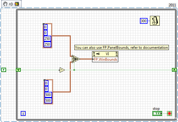
How to change the runtime of height and width of the front panel
How to change the front height and width during execution. Basically, I want to decide height or width according to some parameters that I'm in the moment of execution.
Ed johnsold was first

-
How to change the scale of the Dáil by programming when its reaches the minimum or maximum
How to change the scale range Max and min of the Dáil when her reached to max or min value. For example: my dail has a max and min scale ranging from 0-15 once my dail value reached 15 I change my max and min beach at 15-30 and 30-45 nationally and also vice versa if I reach 30 it should return to 15-30 instead of 30-45... Then I tried some methods but its not working so can someone please provide a solution.
Thank you
Thanks Sabri,
Vi what you have done is really useful that I can be able to understand the concept of managing my needs. I will attach the vi for reference, as its similar to replace the function of x scroll bar in the chart based on the button. This vi is the version of LabVIEW 2015.
-
How to change the number of "windows recently closed" that appear in the menu "history"?
The maximum number of "recently closed windows", I have 3 are available in my menu "history". How can I change the options to get more than that?
Hello
You can try to click right and change the value of browser.sessionstore.max_windows_undo in Subject: config.
- In the address bar, type Subject: config and press enter. The subject: config "this might void your warranty!" warning page may appear.
- Click on I'll be careful, I promise!, to continue on the subject: config page.
The add-on Descriptions of config adds comments of useful source in topic: config.
-
Hello
Happy New Year to ALL
On the Login area:
I would like to know how to change the size of the region of Login and its place.
For example: Login area should have a = 600 height and width = 100 and should be on the right side, not in the center of the screen.
This problem concerns oracle12, apex 4.2 and html5 theme.
Ziut
Ziut wrote:
Hello
for example: apex.oracle.com
workspace: tb2, tb2/tb2
App = 23705
My comp (for example):

style = "height: 600px;" Width: 100px; »
This is only an example. Theme 26.
Ziut
Ziut,
This is the closest I could come to your comp. The simplest implementation, I found was:
- A region has added to the Information
- Place the Login area in a Sidebar area model
- Kept the two regions in the same Point on the screen and the same grid.

I have attempted to substitute the CSS for the Login region but made very little progress and make a slurry in a perspective of support. You should always keep in mind that another person will have to support your claim, a day, and play the more you with him, it may be more difficult to maintain if it is not well documented.
Here's my demo:
Username and password are all two - demo
https://Apex.Oracle.com/pls/Apex/f?p=11956:101
Jeff
-
How to change the Spry CSS tab
I like to use these old screens provided with the former DW Spry tab. I just looked in DW CC and it looks like they aren't there and more. But anyway, I made one for my client. Now, they want to get one of the tabs on the far right of the margin. See the image below:

I don't know yet if it's possible to do and if someone has done this before, can you tell me what code I need to change in the CSS? I would have joined the CSS file, but it seems that you cannot attach files in this forum, so I've copied below.
Please offer any means to change the color of the tabs, etc. - I just need to know how - or at all - this tab can be moved to the right.
Thanks, Guy deaf
PS I'm sorry that the CSS code does not correctly appear in this forum. When I type this message, looks like it will display line-by-line, but it's not. I'm sorry.
---------------------------------------------
@charset "UTF-8"; /* SpryTabbedPanels.css - version 0.6 - Spry Pre-Release 1.6.1 */ /* Copyright (c) 2006. Adobe Systems Incorporated. All rights reserved. */ /* Horizontal Tabbed Panels * * The default style for a TabbedPanels widget places all tab buttons * (left aligned) above the content panel. */ /* This is the selector for the main TabbedPanels container. For our * default style, this container does not contribute anything visually, * but it is floated left to make sure that any floating or clearing done * with any of its child elements are contained completely within the * TabbedPanels container, to minimize any impact or undesireable * interaction with other floated elements on the page that may be used * for layout. * * If you want to constrain the width of the TabbedPanels widget, set a * width on the TabbedPanels container. By default, the TabbedPanels widget * expands horizontally to fill up available space. * * The name of the class ("TabbedPanels") used in this selector is not * necessary to make the widget function. You can use any class name you * want to style the TabbedPanels container. */ .TabbedPanels { overflow: hidden; margin: 0px; padding: 0px; clear: none; width: 100%; /* IE Hack to force proper layout when preceded by a paragraph. (hasLayout Bug)*/ } /* This is the selector for the TabGroup. The TabGroup container houses * all of the tab buttons for each tabbed panel in the widget. This container * does not contribute anything visually to the look of the widget for our * default style. * * The name of the class ("TabbedPanelsTabGroup") used in this selector is not * necessary to make the widget function. You can use any class name you * want to style the TabGroup container. */ .TabbedPanelsTabGroup { margin: 0px; padding: 0px; } /* This is the selector for the TabbedPanelsTab. This container houses * the title for the panel. This is also the tab "button" that the user clicks * on to activate the corresponding content panel so that it appears on top * of the other tabbed panels contained in the widget. * * For our default style, each tab is positioned relatively 1 pixel down from * where it wold normally render. This allows each tab to overlap the content * panel that renders below it. Each tab is rendered with a 1 pixel bottom * border that has a color that matches the top border of the current content * panel. This gives the appearance that the tab is being drawn behind the * content panel. * * The name of the class ("TabbedPanelsTab") used in this selector is not * necessary to make the widget function. You can use any class name you want * to style this tab container. */ .TabbedPanelsTab { position: relative; top: 1px; float: left; padding: 5px 20px; margin: 0px 1px 0px 0px; font: bold 12px sans-serif; background-color: #f1c185; list-style: none; border-left: solid 1px #CCC; border-bottom: solid 1px #999; border-top: solid 1px #999; border-right: solid 1px #999; border-radius: 5px 5px 0px 0px; -moz-user-select: none; -khtml-user-select: none; cursor: pointer; } /* This selector is an example of how to change the appearnce of a tab button * container as the mouse enters it. The class "TabbedPanelsTabHover" is * programatically added and removed from the tab element as the mouse enters * and exits the container. */ .TabbedPanelsTabHover { background-color: #ffd197; } /* This selector is an example of how to change the appearance of a tab button * container after the user has clicked on it to activate a content panel. * The class "TabbedPanelsTabSelected" is programatically added and removed * from the tab element as the user clicks on the tab button containers in * the widget. * * As mentioned above, for our default style, tab buttons are positioned * 1 pixel down from where it would normally render. When the tab button is * selected, we change its bottom border to match the background color of the * content panel so that it looks like the tab is part of the content panel. */ .TabbedPanelsTabSelected { background-color: #ffe9cd; border-bottom: 1px solid #EEE; } /* This selector is an example of how to make a link inside of a tab button * look like normal text. Users may want to use links inside of a tab button * so that when it gets focus, the text *inside* the tab button gets a focus * ring around it, instead of the focus ring around the entire tab. */ .TabbedPanelsTab a { color: black; text-decoration: none; } /* This is the selector for the ContentGroup. The ContentGroup container houses * all of the content panels for each tabbed panel in the widget. For our * default style, this container provides the background color and borders that * surround the content. * * The name of the class ("TabbedPanelsContentGroup") used in this selector is * not necessary to make the widget function. You can use any class name you * want to style the ContentGroup container. */ .TabbedPanelsContentGroup { clear: both; border-top: solid 1px #999; background-color: #FFF; } /* This is the selector for the Content panel. The Content panel holds the * content for a single tabbed panel. For our default style, this container * provides some padding, so that the content is not pushed up against the * widget borders. * * The name of the class ("TabbedPanelsContent") used in this selector is * not necessary to make the widget function. You can use any class name you * want to style the Content container. */ .TabbedPanelsContent { overflow: hidden; padding: 4px; } /* This selector is an example of how to change the appearnce of the currently * active container panel. The class "TabbedPanelsContentVisible" is * programatically added and removed from the content element as the panel * is activated/deactivated. */ .TabbedPanelsContentVisible { } /* Vertical Tabbed Panels * * The following rules override some of the default rules above so that the * TabbedPanels widget renders with its tab buttons along the left side of * the currently active content panel. * * With the rules defined below, the only change that will have to be made * to switch a horizontal tabbed panels widget to a vertical tabbed panels * widget, is to use the "VTabbedPanels" class on the top-level widget * container element, instead of "TabbedPanels". */ .VTabbedPanels { overflow: hidden; zoom: 1; } /* This selector floats the TabGroup so that the tab buttons it contains * render to the left of the active content panel. A border is drawn around * the group container to make it look like a list container. */ .VTabbedPanels .TabbedPanelsTabGroup { float: left; width: 10em; height: 20em; background-color: #EEE; position: relative; border-top: solid 1px #999; border-right: solid 1px #999; border-left: solid 1px #CCC; border-bottom: solid 1px #CCC; } /* This selector disables the float property that is placed on each tab button * by the default TabbedPanelsTab selector rule above. It also draws a bottom * border for the tab. The tab button will get its left and right border from * the TabGroup, and its top border from the TabGroup or tab button above it. */ .VTabbedPanels .TabbedPanelsTab { float: none; margin: 0px; border-top: none; border-left: none; border-right: none; } /* This selector disables the float property that is placed on each tab button * by the default TabbedPanelsTab selector rule above. It also draws a bottom * border for the tab. The tab button will get its left and right border from * the TabGroup, and its top border from the TabGroup or tab button above it. */ .VTabbedPanels .TabbedPanelsTabSelected { background-color: #EEE; border-bottom: solid 1px #999; } /* This selector floats the content panels for the widget so that they * render to the right of the tabbed buttons. */ .VTabbedPanels .TabbedPanelsContentGroup { clear: none; float: left; padding: 0px; width: 30em; height: 20em; } /* Styles for Printing */ @media print { .TabbedPanels { overflow: visible !important; } .TabbedPanelsContentGroup { display: block !important; overflow: visible !important; height: auto !important; } .TabbedPanelsContent { overflow: visible !important; display: block !important; clear:both !important; } .TabbedPanelsTab { overflow: visible !important; display: block !important; clear:both !important; } }!-[CodeBlockStart:dffe5525-a787-4a98-a87f-f24554b12141]-->@charset 'UTF-8'; / * SpryTabbedPanels.css - 0.6 - pre-release Spry 1.6.1 version * / / * Copyright (c) 2006] Adobe Systems Incorporated. All rights reserved. * / / * Horizontal tabbed panels * the default style for a TabbedPanels widget puts all the tab buttons * (stalled left) above the content panel. * / / * This is the selector for the main container of TabbedPanels. For our * style by default, this container does not contribute anything visually, * but it is floated to the left to ensure that all floating or compensation done * with any which of her children the elements lie entirely within the limits the * TabbedPanels container, in order to minimize any impact or unwanted * interaction with other floating elements on the page which may be used * for page layout. * If you want to limit the width of the widget TabbedPanels, define a * width of the container TabbedPanels. By default, the widget TabbedPanels * extends horizontally to fill the available space. * The name of the class ("TabbedPanels") used in this selector is not * necessary to make the widget service. You can use a class name, you * want to style the TabbedPanels container. */ . TabbedPanels {overflow: hidden;} margin: 0px; padding: 0px; Clear: none; Width: 100%; / * Hack IE to force the layout correct when preceded by a paragraph. (hasLayout bug) * /} / * this is the selector for the TabGroup. The container of TabGroup houses * all buttons on the tab for each tabs in the widget panel. This container * does not contribute to what both visually in the appearance of the widget for our * default style. * The name of the class ("TabbedPanelsTabGroup") used in this selector is not * necessary to make the widget service. You can use a class name, you * want to style the TabGroup container. */ . TabbedPanelsTabGroup {margin: 0px;} padding: 0px; } / * This is the selector for the TabbedPanelsTab. This container houses * the title of the Panel. It is also tab 'button' that the user clicks on * to activate the corresponding content panel so that it appears on top * of the other tabs in the widget panels. * For our style by default, each tab is positioned relatively 1 pixel down from * where it would normally. This allows each tab overlap content * panel that renders underneath. Each tab is rendered with a background of 1 pixel * border which has a color that corresponds to the upper edge of the current content * panel. This gives the appearance that the tab is drawn behind the * content panel. * The name of the class ("TabbedPanelsTab") used in this selector is not * necessary to make the widget service. You can use any class name you want * to style the tab container. */ . TabbedPanelsTab {position: relative;} Top: 1px; float: left; padding: 5px 20px; margin: 0px 1px 0px 0px; Police: bold 12px without serif. background-color: #f1c185; list-style: none; border-left: 1px solid #CCC; border-bottom: 1px solid #999; border-top: 1px solid #999; border-right: 1px solid #999; border-radius: 5px 0px 5px 0px; -moz-user-select: none; -khtml-user-select: none; cursor: pointer; } / * This selector is an example how to change the appearance of a button in the tab * container as the mouse enters in the it. The class is "TabbedPanelsTabHover" * programatically add and remove the element tab as the mouse between in * in and out of the container. */ . TabbedPanelsTabHover {background-color: #ffd197 ;} / * this selector is an example how to do to change the appearance of a button in the tab * container after the user has clicked on it to activate a content panel.} * The 'TabbedPanelsTabSelected' class is programmatically added and removed * the tab element as long as the user clicks button tab containers in * the widget. * As mentioned above, for our style by default, the tab buttons are positioned * 1 pixel down where he would normally. What is the tab key * selected, we change its bottom border to match the background color of the * content panel so that it looks like the tab is the content panel. */ . TabbedPanelsTabSelected {background-color: #ffe9cd;} border-bottom: 1px solid #EEE; } / * This selector is an example of how to make a link inside a tab button * look like normal text. Users may want to use the links within a tab button * so that when it gets the focus, the text * inside * the tab button gets a focus * ring around it, instead of the ring around the whole tab. * /. TabbedPanelsTab a {color: black;} text-decoration: none; } / * This is the selector for the ContentGroup. The ContentGroup container houses * all panels of content for each tabs in the widget panel. For our * style by default, this container provides the background color and borders that * surround content. * The name of the class ("TabbedPanelsContentGroup") used in this selector is * not necessary to make the widget function. You can use a class name, you * want to style the ContentGroup container. */ . TabbedPanelsContentGroup {clear: both;} border-top: 1px solid #999; background-color: #FFF; } / * This is the selector for the content panel. The content panel contains the * content for a single panel tabs. For our default style, this container * provides some padding, so that content is not pushed upward against the * widget borders. * The name of the class ("TabbedPanelsContent") used in this selector is * not necessary to make the widget function. You can use a class name, you * want to style the content container. */ . TabbedPanelsContent {overflow: hidden;} padding: 4px; } / * This selector is an example of how to change the appearance of the currently * active panel container. The class is "TabbedPanelsContentVisible" * programatically added and removed from the content as the Panel item * is enabled/disabled. */ . TabbedPanelsContentVisible {} / * vertical tabbed panels * following rules override some of the default rules above so that the * TabbedPanels widget is rendered with its buttons on the tab on the left of * the active content panel. * With the rules defined below, the only change that will be made * to move a widget panels to horizontal tabs to vertical tabbed panels * widget, is to use the 'VTabbedPanels' class on the top-level widget * element container, instead of "TabbedPanels. */ . VTabbedPanels {overflow: hidden;} Zoom: 1; } / * This selector floats the TabGroup so that the tab buttons it contains * make left of active content panel. A border is drawn around * the group container to make it look like a container from the list. */ . VTabbedPanels. TabbedPanelsTabGroup {float: left;} Width: 10em; height: 20em; background-color: #EEE; position: relative; border-top: 1px solid #999; border-right: 1px solid #999; border-left: 1px solid #CCC; border-bottom: 1px solid #CCC; } / * This selector disables the float property that is placed on each button of the tab * by the rule above TabbedPanelsTab default selector. He also draws a background * border for the tab. The tab button will get his left and right border of * the TabGroup and its superior border of the tab above it or button TabGroup. */ . VTabbedPanels. TabbedPanelsTab {float: none;} margin: 0px; border-top: none; border-left: none; border-right: none; } / * This selector disables the float property that is placed on each button of the tab * by the rule above TabbedPanelsTab default selector. He also draws a background * border for the tab. The tab button will get his left and right border of * the TabGroup and its superior border of the tab above it or button TabGroup. */ . VTabbedPanels. TabbedPanelsTabSelected {background-color: #EEE;} border-bottom: 1px solid #999; } / * This selector fleet contained signs of the widget while they * make it to the right of the tabs buttons. */ . VTabbedPanels. TabbedPanelsContentGroup {clear: none;} float: left; padding: 0px; Width: 30em; height: 20em; } / * Printing styles * / @media print {.} TabbedPanels {overflow: visible! important;}. TabbedPanelsContentGroup {display: block! important;} overflow: visible! important; height: auto! important; } . TabbedPanelsContent {overflow: visible! important;} display: block! important; clear: both! important; } . TabbedPanelsTab {overflow: visible! important;} display: block! important; clear: both! important; } }
Add the class like below:
- Open Ocean
-
How to change the tag page layouts
I'm trying to change my great model produced. When adding the tag related products he puts them with horrible HTML full of Tables etc. I can't seam to figure out how to change the layout for the tags. What Miss me?
{module_facebookcomments, url ="http://www.impactnations.org/{tag_itemurl_nolink}", moduleTemplateGroup = "Default", local = 'en_US', message = '2', width is '500', olorScheme = 'light' c}{tag_name}
{tag_poplets}- Price:
{tag_saleprice}
- {tag_attributes}
- {tag_grouping}
- Quantity: {tag_addtocartinputfield}
- {tag_buynow}
Description
{tag_description}Related products
{tag_relatedproducts}You have a few options with the configuration of the tag:
But what makes a tag on is what you have to work with.
- Price:
-
How to change the default orientation?
Hello
I am new to Adobe Flash Builder and am currently a mobile application for a school project. I was wondering how to change the default application in landscape mode orientation. I tried to go into my app.xml and change the proportions in mode landscape with no luck, and it is very difficult to find answers on the internet. I would greatly appreciate your help.
Code HomeView.mxml:
<? XML version = "1.0" encoding = "utf-8"? >
" < = xmlns:fx s:View ' http://ns.Adobe.com/MXML/2009 "
xmlns:s = "library://ns.adobe.com/flex/spark".
actionBarVisible = "false" tabBarVisible = "false" title = "HomeView" >
< fx:Declarations >
< / fx:Declarations >
< s:Image left = "0" right = "0" top = low "0" = "0" scaleMode = 'zoom' smooth = 'true '.
smoothingQuality = 'high' source="@Embed('file:///C:/Users/Owner/Downloads/48127-solarsystem-teaser.jpg')" / > "
< s:Button = "-5" x = "0" width = "410" height = "1504.
skinClass = "spark.skins.mobile.TransparentNavigationButtonSkin" click ="navigator.pushView (Sun)" / > "
< s:Button = "444" x = "852" width = '80' height = '80 '.
skinClass = "spark.skins.mobile.TransparentNavigationButtonSkin" click ="navigator.pushView (Mercury)" / > "
< s:Button "628" = x y = "742" width = "120" height = "124".
skinClass = "spark.skins.mobile.TransparentNavigationButtonSkin" click ="navigator.pushView (Venus)" / > "
< s:Button "836" = x y = "632" width = "127" height = "117".
skinClass = "spark.skins.mobile.TransparentNavigationButtonSkin" click ="navigator.pushView (Earth)" / > "
< s:Button "994" = x y = "506" width = "99" height = "96".
skinClass = "spark.skins.mobile.TransparentNavigationButtonSkin" click ="navigator.pushView (March)" / > "
< s:Button "1255" = x y = "464" width = "298" height = "279".
skinClass = "spark.skins.mobile.TransparentNavigationButtonSkin" click ="navigator.pushView (Jupiter)" / > "
< s:Button "1626" = x y = '302' width = '274' height = '270 '.
skinClass = "spark.skins.mobile.TransparentNavigationButtonSkin" click ="navigator.pushView (Saturn)" / > "
< s:Button "1965" = x y = "196" width = "175" height = "174".
skinClass = "spark.skins.mobile.TransparentNavigationButtonSkin" click ="navigator.pushView (Uranus)" / > "
< s:Button "2201" = x y = "66" width = "175" height = "174".
skinClass = "spark.skins.mobile.TransparentNavigationButtonSkin" click ="navigator.pushView (Neptune)" / > "
< / s:View >
App.xml code:
<!-the original proportions of the application at the launch ('portrait' or 'landscape').
As an option. Mobile only. By default, it is the natural orientation of the device->
<!-landscape < aspectRatio > < / aspectRatio >->
<!-if the app will start to auto-orienter the launch. As an option. Mobile
only. Default value false->
<!-false < autoOrients > < / autoOrients >->
I need to make sure the app is constantly in the landscape.
Thanks again.
8 student
In XML, while is a comment. You must remove the :
landscape fake -
How to change the length of line objects
Hi all
How to change the length of the line objects.
I know how to change the width or height of the elements.
Utils < Facade::IGeometryFacade > ()--> (ResizeItems)
itemList,
Transform::PasteboardCoordinates (),
Geometry::OuterStrokeBounds (),
refPoint, Geometry::ResizeTo (newWidth, newHeight)
);I know the new length and PMrect of the line item before moving.
What I want to know is how to get the new width and height of this.
Thank you.
Fujimori - Satoru
Find your old address of trigonometry and read the part about the Pythagorean theorem. This will give the scale factor you need to get the old PMRect to the new


Delete the following in your css spry as file its in the ' query print media "and has no effect on the screen - have added you it to the wrong place."
{.alignRight}
position: relative;
Top: 1px;
float: right! important;
padding: 5px 20px;
margin: 0px 1px 0px 0px;
Police: bold 12px without serif.
background-color: #f1c185;
list-style: none;
border-left: 1px solid #CCC;
border-bottom: 1px solid #999;
border-top: 1px solid #999;
border-right: 1px solid #999;
border-radius: 5px 0px 5px 0px;
-moz-user-select: none;
-khtml-user-select: none;
cursor: pointer;
}
Add the below css just above the press query written:
{.alignRight}
float: right! important;
}
/ * Print styles * /.
@media print {}
Maybe you are looking for
-
Tablet have a screen big enough to be able to support full web pages
-
Qosmio F30: Is it possible to buy a personalized copy of Microsoft Vista
Is it possible to buy a copy custom Microsoft Vista which is designed for computers laptops Qosmio, just as others offer?
-
PicoLog example VI do not save data properly
Hey, I'm playing with the example provided by picolog VI 104. I'm trying to record data of temperature with the stamps. See the attached VI. For some reason, the saved CSV file this code produces only consists of two lines, the first'Time, temperatur
-
I get this error message after I start my pc. BTTray.exe - application failed to start because wbtapi.dll is not found, reinstalling the application may fix this problem. I do not even begin to know what wbtapi.dll is, where can I find to reinstall?
-
How to find the model, the product and the serial number of your HP printer
Need help with your printer, but don't know exactly what are you? Here is a video that can help!