XY-graph, constant real time of 30 minutes interval
I want to create an XY Chart with a time interval of 30 minutes. X - minimum scale should be the time that the program starts and the X-range maximum 30 minutes from starting point. Example: From 10:00 program: the chart must be on the scale of 10:00 to 10:30, no autoscaling. After 30 minutes, I want to from 10:30 to 11:00.
Someone knows how to do this?
Right click on the XY graph and play with the properties and you should be able to achieve what you want.
This is the programmatic approach to do this.
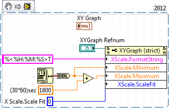
Also atatched is the code for the same (registered in the 2012 version of LV).
Tags: NI Software
Similar Questions
-
make a graph in real time of 1 DBL value at a time, using a loop for
I have a somewhat interesting programming task where I have the following situation: (I have attached a mac version of vi Labview 2013)
-Using a patented (pre-made and uneditable) sub - vi, who receives a value of 0 or 1 as input and reads off a single measure, whenever he receives 1 while a value of 0 is necessary to 'reset' of the vi to rehearse a new measure.
-I would like to run this sub - vi repeatedly in a loop For each value of "measure" are sent to a curve of waveform to give a direct value (real time) for the graphic to display.
-As it is, I have a vi file that simulates action in a loop but built in a 1 d array to get exuent values sent a waveform curve.
-I don't know how to make a real-time graph which receives 1 value double both.
-In addition, I want only every 2nd value sent to the loop for, but I already have several ideas on how to do it. First of all, I am concerned about the target in real time.
Kyle Shiel
A graphic, not a graphic, allows you to update a point at a time. It would be inside the loop for. update the chart or not, you can use a select statement or the structure of the case.
These are pretty basic functions in LabVIEW. Please see the free tutorials.
-
Get the frequency of a graph in real time of the waveform trace
Hello
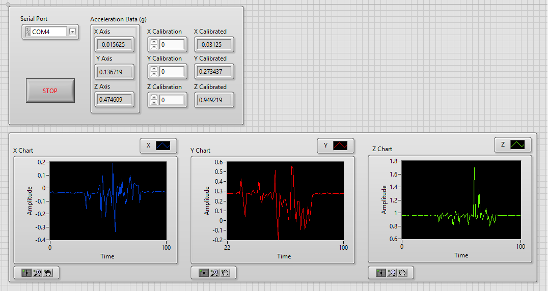
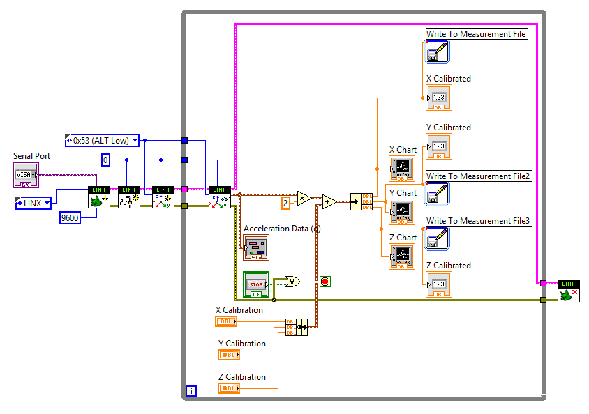
I want to get the frequency of the graphics path in real time. The data comes from a connected to an Arduino UNO ADXL345. I use LINX to read data.
I separated given x, y, z in order to plot separately and later to get their respective frequencies as well.
Here is an excerpt of my VI as well as the front panel.
I used a the Measurment file for each axes entry so I have a copy of the data.
Before posting, I tried the LabView Spectral tutorial first. But it's different from what I want to happen because you know the exact frequency in this tutorial.
I have also attached my VI.
Thank you!

If all you want is to know the spectral content of a signal in the time domain, there are a number of examples show how to do it. I would start by looking at the functions of the FFT.
Mike...
-
Move the data to the left and to the right on the graph in real time
I have a 1 d table X and Y Bay 1 d of the XY graph.
I want to move the chart along the x axis. I not want to act as if I'm grabbing the plotted values and moving them.
I thought that would be simpler to add a slider value to each of the X 1 d elements of the array. The value keeps adding when I move the cursor is positive and subtracting when the cursor is negative. I want the graphic to move left or right when the cursor moves.
Any ideas?
Thank you!
Michael,
Here's what I found works. It is much simpler than what you suggested, but there may be a few errors that can result from programming immproper. I'm not sure.
-
cumulative subtraction on real-time data
Hello
I'm new to LabVIEW and have a fundamental issue in the case. I am acquiring data on the frequency of multiple CHOICE which I want to treat in order to display the change in mass on a graph in real time!
I have a formula that says f1 - f2 = const * dm (dm is the change in mass)
So I want to calculate f1 - f2, f2 - f3, f3 - f4 and so on... I know the concept of shift registers, but am not able to implement in my circuit
I have attached the VI. Please guide me.
Thanks in advance!
Hi netra.
'circuit' is called "block diagram" in terms of LabVIEW! It is a programming language and no designer of electronic circuits...
In your VI I place no 'f', 'mass', 'frequency' or 'Multiple CHOICE' indicators. It is really difficult to follow your VI when your description does not provide any useful information.
Create a shift register in your loop. Store the current value in the shift register. A subtraction to calculate the difference of current and previous value:

The same solution is displayed using a feedback node instead...
-
Continues to draw in real time
Hi all!
I use the graph XY to plot multiple data receives serial com and I wanted to show the graph in real time. My question is, how to do from the beginning?
Thank you!
Why do you use an XY graph instead of a chart?
-
Hello
In the attached VI in labview 8.5, I wanted to show two plots on the same graph in real time. In other words, for each iteration in the 'loop', updates to the graph. I am not able to do this with one of the plots (y1) but holds two data sets - are to appear on the graph (that is to say the y1 and y2). Is it possible to do it in real time?
Thank you
hiNi
It is possible to do it with a XY Chart. The data of the XY-graph accepts for plotting of graphs of mutiple are a set of clusters. The cluster consists of two arrays containing the x values and y. I have included the vi with the solution for you.
I hope that this solves your problem.
Best regards.
-
Hi I have measured data using a SELF-DIAGNOSIS device and that you have downloaded the log files as a .csv I have attatched below. I'm trying to read the 7th column of data (RPM) and display it on a waveform graph, read line-by-line to simulate driving real-time data. The interval between readings, I'm trying to achieve is 500 Ms because it is the time interval of readings on the worksheet. I'm finishing the two loops when rpm is equal to zero, as happens when the car is off. I have attatched the relevant section of my program below. Any suggestions would be greatly appreciated.
Thank you
Michael
There are two errors in your block diagram. First of all, as you read the entire table 2D in all at once (which is fine), you make a clumsy (pardon my language) job to make a line of programming. Once you take the first line of headers, you have the ideal substrate for a loop, which is made of elements of an array (lines) process, one at a time, using its tunnel of indexation.
The second mistake is to forget data flow. The loop, I mentioned, or the While loop you use, produced one at a time and points it at 2 Hz thanks to your expectation of 500msec. You want to give each point to your chart, but the picture is out of the loop, which means that there is No point until the loop ends.
Here's an easy Question - where you put the indicators in table of waveform? [Council - I said that "outside the loop is bad"].
Bob Schor
-
Choose what data to track in real time
Hello, I was wondering if anyone knows how or if there is a Subvi so you can alternate between what data will go on a waveform graph, while the program is running. I have three forces entered in table of vs. time waveform. I can see everything on the graph in real time, but I was wondering if it is possible to switch between just Fx vs time, just the exercise against time, or all forces based on time, etc.
Any help would be appreciated.
Thank you!
There is also a very simple example on our community page. You can find it here.
With regard to the structures of the event, Jeff is right, there are some great examples in the finder for example LabVIEW.
-
The performance improvement chart real time
I'm working on a simple graph in real time. The data is queried every 50ms, and each survey results in a line one pixel wide, height in pixels (data_point) . The chart scroll such as new data is located on the right, and the oldest values ends up by falling from the left.
In other words, pretty basic.
My solution is embarassingly brute-force, in what I just use theMC.graphics.clear () and a loop of lineTo()s for each graphic update. If this appears correctly (and I can control the refresh rate to mitigate CPU burn), it should be painfully obvious why I want to get away from this method.
I have to scroll or pan the a full graphic pixel to the left (and remove the line to the left) and then just pull a new line on the right, but I don't know where to start. Assuming that such a thing is possible in AS3, someone would be kind enough to point me in the right direction?
This can be done a few ways.
First class graphics.
its safe to assume that you draw with the graphics removed the displayObject?
Otherwise, you make several updates in the loop.
Remove the displayList drawing while pulling all parcels.
Then, BitmapData.
You can use scroll(1,y) to move the image to the left. In addition, by using bitmap data, you can lock the bitmapData to limit the refreshment of a given area.
workign with the image bitmap information is easier to use when drawing... Of course, this requires a little more math you can't use just line with bitmapData.
But you can use a matrix to rotate a line at 90 degrees and increase in length.
-
Background:
I have a table of about 10 000 points, what I need to graph. The original way that was done in PHP was to simply create a 10 000 image pixels wide and put in a box with overflow hidden and use JavaScript to move the image to the left at all times to make it look more lively. When I try to do that in flex using mx:move, the graph is too nervous. I want to go smoother. When I use only 200 of our data points in the chart moves pretty smooth for me. I tried to increase the pace and also used mx:AnimateProperty on 'x', but it seems to be the size of the image that is the problem.
Current idea:
My new idea is to have a window of 500 pixels and draw the graph in real time. The theory is that the graph would begin putting 500 points in the area of the first 500 values in the table. then, in each image, each point takes the value of one on his right and the last of them takes the next value in the table. I have not the slightest idea where to begin to make this happen or if it is still the best course of action. Any help is appreciated.
or perhaps cela?
http://www.stretchmedia.ca/code_examples/chart_range_selection/main.html
-
How do to accumulate data acquired in the table for a real-time XY graph plotting
I have current and voltage values which I would like to draw the graph XY.
Problem is that these are 1 d signals.
1. Please tell me how I can earn these value in table, so I can have my XY trace.
2. is there another way to plot in time real graphic XY of the acquired values.
(I use NI 9205 analog module. I can see real-time signals i.e. time vs current and voltage time vs on my front.
I need voltage vs current values in real time).
You can help.
Thank you.
Try something like this...
Notes:
- If you simulate "as soon as possible", you put a period inside the loop.
- As the table grows forever, you will be eventually run out of memory.
- Since the x and y of the simulation is at the same frequency, all points will be on the same line.
-
Make a graph that is customized by using the motion of the instrument and in real time
I am very new to LabVIEW and I need to make a graph or a table with the data being the movement of a device and the x data in real time. I know how to get the position of the instrument information and how to put in real time for the x axis, but I have no idea how to wire those things in a graph, what type of graph to use, or what other screws I need for the y - data. I have attached the page I'm working on that... It's kind of just a meli melo of things I thought that may be useful, but I obviously need help. Thanks in advance.
Have you so far in your VI, it seems you will ask some data on the location of your device on each iteration of the loop. In this case, you can use a waveform diagram in the while loop to display these points. Each new point will be added to the table as they come. You can do this by writing values to the table as you reach them inside the while loop. This link should also be able to clear up some confusion about the differences between the tables and charts in LabVIEW.
-
How can I get a graphic display in real time of a task daqmx
Hello
I have set up a task DAQmx using the DAQ assistant and the task is to work and produce a graph/data, but not before the task is complete. How can I get a display in real-time of the numberical values or graphics?
Any help would be really appreciated
Thanks, Paul
paultryan wrote:
I could get set the frequency of sampling and to give a regular change of output, but im looking to get this long-term data acquisition. For example, the graph changes everything but 1 - 5 get 30 minutes of data.
I used the DAQ assistant and labview is completely new to me, if im not sure where it take it from here.
concerning
Then you should use a chart - not a graphic. A graph has a story. You must set this. Right click and select "Chart History Length".
-
How to plot several points in real-time on a XY chart in different colors?
Hello
I am a beginner of labview. Here is a screenshot of the program. It provides information in real time to a patient when walking from their foot position, random target (points Exchange with each step) and a reference point (constant). At present, data from three points are grouped in the same plot on the graph XY. In the graphics property, when I change the color for field 0, every color change. I tried to connect the XY graph in table built above, but a cut wire it occurs (connected 2 groups with different content).
Any help would be great! Thank you
Amarcher wrote:
Thank you. I tried to change the plots in properties, but it did not work.
Here's what you can do with very minor changes. It is basically the same as in my previous example.

Maybe you are looking for
-
Install the satellite L35-S2161 - OS and the necessary drivers
I'll replace it the hard drive in my Satellite L35-S2161 next week. (I tried this a couple of weeks, but I couldn't get the wireless or PowerSaver utility to work so I put the hard drive and everthing back in original works) So what drivers should be
-
Re: Qosmio X 500 - USB stop after closing the cover of load
Tried to sleep and the Player loads a philips mp3 and bluetooth device and as soon as I close the lid, they stop to load. Tried the settings of two load and not go. Any suggestions?
-
All-in-one HP Evny 23-1075: Ralink "unavailable".
I currently meet a Ralink WiFi card problem with my windows 10 machine. This morning trying to connect to internet, my WiFi Ralink card was "unavailable" as soon as I started the computer. I decided to re - start the computer and Ralink is not yet av
-
Change Alpha 12 external monitor?
Hello could someone please give me a hint how to use an external monitor with the Alpha 12 switch? I already bought a usb - c for an hdmi cable. But unfortunately, the alpha 12 complains only that it does not recognize the usb device and my external
-
all the answers to my title?