selected in a pie chart slice
Hi Experts,
I have a dvt:pieChart with my page, where dataSelection = single,.
When the user clicks on a slice of the pie chart, I need to capture the selected value and based on this value, I need fill a table below the pie chart.
I tried Googling, unfortunately impossible to find the appropriate solution.
I use Jdeveloper 12.1.3.
Please do the needful.
As you use pieChart not pieGraph then create a selectionListener in bean managed to get the selected slice
Follow these steps-
1 set dataSelection property of unique pieChart
2 create a selectionListener method in bean managed to chart
3 see the property value of the graph, it will be something like this - #{bindings. Deptartment1.collectionModel}
4 copy and use this managed code bean (name value and iterator change according to your name viewObject)
/** * Programmatic invocation of a method that an EL evaluates to.
* * @param el EL of the method to invoke
* @param paramTypes Array of Class defining the types of the parameters
* @param params Array of Object defining the values of the parametrs
* @return Object that the method returns */
public static Object invokeEL(String el, Class[] paramTypes, Object[] params) {
FacesContext facesContext = FacesContext.getCurrentInstance();
ELContext elContext = facesContext.getELContext();
ExpressionFactory expressionFactory = facesContext.getApplication().getExpressionFactory();
       MethodExpression exp = expressionFactory.createMethodExpression(elContext, el, Object.class, paramTypes);
        return exp.invoke(elContext, params);
   }
    /**     * Programmatic evaluation of EL.
* * @param el EL to evaluate
* @return Result of the evaluation */
public static Object evaluateEL(String el) {
FacesContext facesContext = FacesContext.getCurrentInstance();
ELContext elContext = facesContext.getELContext();
ExpressionFactory expressionFactory = facesContext.getApplication().getExpressionFactory();
        ValueExpression exp = expressionFactory.createValueExpression(elContext, el, Object.class);
        return exp.getValue(elContext);
   }
    public void pieChartSelectionListener(SelectionEvent selectionEvent) {
invokeEL("#{bindings.Department1.collectionModel.makeCurrent}", new Class[] { SelectionEvent.class }, new Object[] { selectionEvent });
// Get the selected row (Use pie chart iterator name) , by this you can get any attribute of that row
       Row selectedRow =            (Row) evaluateEL("#{bindings.Department1Iterator.currentRow}"); // get the current selected row
        System.out.println("Selected Department is-" + selectedRow.getAttribute("DepartmentName"));
    }
Ashish
Tags: Java
Similar Questions
-
Change the number format in slice of pie chart label
Hello
I created a pie chart that shows the percentage cuts in 1,2,3 decimals. I want to show only up to 1 decimal place. Please suggest how to manage it in the pie chart.
Kind regards.Paste this into the text of the chart,
Click with the right button on the image, select the image format and go into the ALT text tab.
paste it between the chart element and not at the end or in the beginning. -
So I created a diagram using the Pie chart tool in artificial intelligence, data are correct once it's done, but I can't change the colors. After you enter the number in the cell, select the checkbox. It's the pie graph. Will not let me choose the only separate slices so I expanded the complete graphic, then select direct changes color. It allows me to select the separate range, but when I go to change the color she either doesn't it change to a shade of gray to another. I need the actual color.
Any suggestions? Have tried to make several different graphs but always the same question. With the help of creative cloud
You should be able to direct the selection party individual of a graph "on-line".
This led to corrupt files in some cases, however. So you might want to test this carefully.
If the color Panel does not show the color sliders, try and select CMYK in the Panel menu. If that does not show, first apply a color swatch and then change its values.
-
Creating a pie chart of the cell Type dropdown
I do a log of time to monitor the time I spend on the task. My goal is to have an easy way to show the categories of time that I spend on a daily basis.
I created a simple table that calculates the hours I spent on a task. In the last column, I have cells of type menu pop - up allowing me to choose a category to assign to this line.
How can I create a Table of categories and then a related pie chart that will allow me to see the time in each category?
I saw this thread: Re: creating a pie chart from of pop-up Menu in figures but it doesn't seem to work for me.
Here's what I have so far:

FYI, the formula I use to mean hours in column D is: IF (GOLD (ISBLANK (B2), ISBLANK (C2)), DURATION (0), C2−B2)
Any help would be appreciated. THANKS IN ADVANCE!
The formula in your summary might look like this:

= SUMIF (Time Log::E, A2, Time Log::D)
To produce the table, I've selected all the cells in the summary table and chose 2D pie.
SG
-
Where should I go on my computer to find the pie chart that shows how much space is used/left on my computer... (my question is not related to the questions at the beginning).
Open my computer, right-click the drive icon, select 'Properties' and you'll see the pie under the general tab.
Jim
Microsoft MVP - moderator of the Forum - consumer security live a care - Live Mesh - Microsoft Security Essentials
-
What is the correct syntax for a 'pie chart - multiple' report in Oracle SQL Developer? I am creating master-child where the master is a bar graph and report the child reports are (multiple) pie charts. The master report looks good, but I can't the child reports to display in the form of pie charts. The child statement correctly table view, but if I change the pie chart format, then I get the error message: 'data is zero or negative value and can not be displayed'.
Here are the current request for reports of the child:
SELECT the year, college_name, student_id, count (student_id) as count_ids
DE registration
WHERE college_name =: COLLEGE_NAME
GROUP BY year, college_name, student_id
ORDER BY year, college_name, student_id;
This is the report of the child table:

It's about what I want pie charts to look like:

It works if you remove the name of college?
I am able to make a graph to child multiple sectors out of a bar parent graph, without having to configure anything on the properties of the child report definition data

Here's my child report query:
Select the year, the team, sum (points) of hockey_stats
where drive =: PLAYER
Group of the year, the team
order by year desc
If you run your query, you have nulls, zeros or negative values for count (student_id)?
-
Buttons on a pie chart and the display text
It has been a long time since I created something like this in Captivate. I used to use the alternative option to display text, and when they released the text would disappear. How do I create pie shaped buttons (on a pie chart) allow to click the chart and display the text, then click on another piece and hide the text, but they would be allowed to click coins out of use. I know this is really Basic for one :)
Thank you
Sabina
You can use the smartshape. If you use a triangle, you can right-click and select freeform and then change the button in a wedge/pie. Fix advanced actions to display the text and hide all other texts.
You can create the tarts in another program and use image buttons. I think it would be much easier.
-
How can I change the contour of pie chart from black to white?
I created a pie chart in Illustrator CS6 and may not know how to change the line of contour of the black to white (this is my first time trying to create a pie chart in illustrator and not found the answer to my question in any of the graphic illustrator formatting instructions.)
With camembert fully selected, open the appearance Panel, double-click on "Content" and change the color of the outline.
-
Hi guys,.
I'm creating a WCF report with information on availability of the different AppMonitor Agents.
Officials reported a metric called "availability".
I also created a query that returns an average of the availability of the Agents AppMonitor selected.
Now the fun starts. I wan't to build a pie chart to show real time.
The problem is, if I add the availability, lets say 98%, as an element, he draws me a filled full circle.
If I add a second element having the value "2", fine.
How to calculate the percent to get a good pie diagram or y at - it an easy way?
Yet once in short:-query returns the value of the availability,
-need of camembert, indicating the actual availability
Any ideas?
Hi, Falco,
I would put the query in additional context, assigned to the "availability".
Create a function that accepts 2 double values and returns the difference.
Put another additional context called "still", the new service, from 100.0 and "availability".
Draw the two values of context on your pie chart, then "keep" white and not a legend.
Hope this helps, I did not have time to test earlier.
John
-
Pie chart 3D with bevel deteriorates after export from indesign.
I was the creation of 3D pie charts in illustrator and then placing them in the form of illustrator (.ai) files directly in my indesign document. However after doing so, he has a big loss of quality. The effects of light out as the striated white lines. Sometimes, there are random lines in works of art.
Pie 3D with no lighting effects and no bevel seem to be doing well.
To work around this problem, I exported the work as TIFF from illustrator and then placing the TIFF in indesign. It is a heavy workaround, increases the size of the file and also degrades the text under my camembert much.
The two programs are CS5.
Thank you.
If you paste in front, the object will be selected to the dough. Just do not deselect anything.
Sorry... Adobe went and changed the name... use Pathfinder > unit (it was called 'Add', a version or two), it takes the whole shape and makes a single object/path.
Base color may be any color but white. Generally, I choose a base color that matches the color of the overal of the subject of the question.
You could simply try the steps, then undo if you don't like the results.
-
Hello Experts,
I am new to the apex.
I want to draw a pie with a single value.
that one value should resemble a slice in the pie chart.
I tried, but it shows that any graph as a value.
So please help me in this regard.
Its very urgent.
Please, I beg you.Hello
I don't know if I understand your question, you want to pie chart or line chart? If you draw two lines in a single chart, you add another series to the chart. Click on the graph and click on add another series, enter another sql for the series and you should be all set. Thank you.
Kind regards
Manish -
Hello
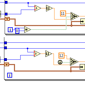
I found this example of chart areas, I tried to use several pie charts, but the place of the label to move in a table. It shows the place moved down when using the vi.
I've attached an example with 4 pie charts and sometimes it shows the 4 places and sometimes down to one. No way to adjust it?
I would like to see some examples with the 3d pie chart. Do you know any example?
Thanks in advance!.
Fred
Sorry guys! I got it.
Change the first time call to the comparison of the loop For = 0, so always start with the value set to draw the square.
Thank you.
-
Adding key event to different parts of a pie chart
Hi, I'm working on a Blackberry app I need to create pie chart from an array of integers. Unfortunately I could not find any graphics APIs for Blackberry (is there really one?), so I've implemented using the method (graphics.fillArc).
Here's my PieChart class:
public class PieChart extends Field
{
    //declaring private variables to store data
    private int[] percentage;
    private int[] angles;
    private int totalRecords;

    //declaring colors to be used in pie chart
    private final static int[] availableColors = { 0x00CDCD, 0xFF0000, 0xFF00FF, 0xCC9900, 0x9900FF, 0x990000, 0x66FF00, 0x6600FF, 0x3300FF, 0x0000FF};
    private final static int totalAvailableColors = 10;

    //assuming 250 for chart width and height
    private int chartWidth = 250;
    private int chartHeight = 250;

    public PieChart (int[] marks)
    {
        //calculating percentages and angles covered by each record
        totalRecords = marks.length;
        int sum = 0;
        for (int i = 0; i < totalRecords; i ++)
            sum += marks[i];
        percentage = new int[totalRecords];
        angles = new int[totalRecords];
        for (int i = 0; i < totalRecords; i ++)
        {
            double percent = marks[i] * 100 / sum;
            percentage[i] = (int) percent;
            angles[i] = (int) (percent * 3.6);
        }
    }

    protected void layout(int width, int height)
    {
        //setting the field to cover the whole width of display
        setExtent (Display.getWidth(), chartHeight);
    }

    protected void paint(Graphics graphics)
    {
        //generating a random color from predefined colors
        Random random = new Random();
        int lastAngle = 0;
        int previousColorIndex = -1;
        int startColorIndex = random.nextInt(totalAvailableColors);
        int currentColorIndex = startColorIndex;

        //adding offset to create the chart at center of the screen
        int offset = (Display.getWidth() - chartWidth)/ 2;

        for (int i = 0; i < totalRecords; i ++)
        {
            //if last record, cover the remaining area of the circle
            int finishAngle = i == totalRecords - 1 ? 360 - lastAngle : angles[i];

            //drawing the arc
            graphics.setColor(availableColors[currentColorIndex]);
            graphics.fillArc(offset, 0, chartWidth, chartHeight, lastAngle, finishAngle);

            //calculating text position to print the percentage
            int txtX = (int) (125 + 75 * Math.cos(Math.PI * (lastAngle + angles[i] / 2)/180));
            int txtY = (int) (125 - 75 * Math.sin(Math.PI * (lastAngle + angles[i] / 2)/180));
            txtX -= graphics.getFont().getAdvance(String.valueOf(percentage[i] + "%")) / 2;

            //drawing the percentage over the respective section
            graphics.setColor(Color.WHITE);
            graphics.drawText(String.valueOf(percentage[i] + "%"), txtX + offset, txtY);
            previousColorIndex = currentColorIndex;

            //tracking total angle used so far
            lastAngle += angles[i];

            //checking if color generated is previous color or starting color, if it is the last of the record
            do
            {
                currentColorIndex = random.nextInt(totalAvailableColors);
            }
            while ((i == totalRecords - 1 && currentColorIndex == startColorIndex) || currentColorIndex == previousColorIndex);
        }

    }

}
Now, when the user touches a any part of the generated pie chart, I need to show him the details of this particular section, which is different for different parts of the chart (for example. Say that if brands of students is used, during the click on an article I have need to display information about the marker). From my understanding, different parts of the pie chart must be different fields to contain the touch individual events. However, it seems there is no way to create irregular fields, and I can't reach camembert if I use fields rectangular for different parts of the chart (such as it's going to tear the pie!
 ).
).Any suggestions?
BTW I develop for BB OS 6.0 (Blackberry Torch).
The word dreaded no programmer doesn't want to hear: math. You'll just have to figure out where all of your divisions are based off of their percentages, determine where the touch and then discover what segment is in.
In fact, I don't think it's going to be too bad, just refresh you on geometry.
-
How to call a negative value in a PIE chart
We have some picky users that want the data that some of these negative in a pie chart. I use ABS() for show as positive negative measures and to make them appear, but I would like a way to be able to scream if one of the calculated items that appears in the PIE charts as negative when it is. Is there a way to color the pieces of pie by any other calculation that would show if the value is negative or a textbox communicate this element calculated is negative for this year?
Seriously... the PIE is the wrong visualization for + ve and ve - values (a PIE is to compare the values of %)... Use the bar and then the values of ve - go below the x-axis. You use ABS() bad negative positioning the real %s from the rest of the numbers - results in the wrong information that gives rise to wrong decisions - push this obligation!

-
How do label you pie charts in excel 2103
How do label you pie charts in excel 2103
Hi Tommy:
Thanks for the response, but still the problem with multiple labels of legend. The link mentioned only a single label legend on a pie chart, which was not a problem. This is labelling the other elements of the 5 the chart legend. There are currently 1 label with the other points being blank.
Thank you
Robert
Once again...
He must ask these questions in the forums Microsoft Excel - those who are SPECIFICALLY for Excel issues. In other words - 'experts' who hang there are expert in Excel. You get people in this forum who are more into the OS in general - maybe a few application expertise sprinkled in here and there - but if you want someone who lives and breathes "Excel" - more likely to get in a forum dedicated to it. (Click on the link, after a new question and I would say SEO - with a link - this conversation too!)
Link to this conversation:
How do label you pie charts in excel 2103
This could be a start (Google search or even looking for the page that I linked works you original very well, apparently...)
http://www.excelforum.com/Excel-charting-and-pivots/811351-multiple-data-labels-on-bar-chart.html
But then again... You should ask such questions in the forums of Microsoft Excel<-- they="" will="" more="" likely="" be="" able="" to="">


Maybe you are looking for
-
Spent some time evaluation ISO real on the FS7 - find ISO real to be about 800 versus the nominal 2000. S - Log3 18% gray and white 90% of shooting targets, setting the iris to achieve 41% and 61% IRE respectively. His subject of law?
-
HP psc 2210: clear jam on my hp psc 2210 all-in-one printer
The lights on my printer and the message says: "open the door. "Clear carriage jam, and then press ENTER. I do not see a "jam", opened the door and press enter several times. I still can not reset unplugged machine from one day to the next. I thin
-
I need help finalize my disc. IMPORTANT!
I tried to finalize my dvd - r on my canon recorder, but it would not it says finalizing in black. I really need this video developed.
-
Microsoft Phone Activation does not work
I had to replace the motherboard and CPU on my computer that has Windows 8 is installed. It resulted in Windows, launch an error where it says that Windows is not activated and that the key is not valid. Using Activation Wizard I tried to connect to
-
Hi friends,Jdev Version: 11.1.1.7I'm trying to load the velocity model in backing bean, AMImpl.But not where it loads. It is throwing at getTemplate null pointer exception, method.I tried to give different ways as below, yet I am unable to load it.Is