How to change the business rule in the runtime
I create a business rule and add it to a BPEL process. After deployment, this process works very well.How to change the rule at run time? I want to say that I did not need to redeploy the process.
In the case of 11 g,.
You can use SOA composer to change the rules of business in run mode.
http://host:soa_server_port/soa/composer
But the composer will be available only in the Group of hotfixes (11.1.1.2.0) 1. It is not available in 11 GR 1 material SOA (11.1.1.1.0)
If it is 10g, you can use Ruleauthor UI
http://host/ruleauthor
Tags: Fusion Middleware
Similar Questions
-
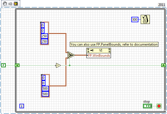
How to change the runtime of height and width of the front panel
How to change the front height and width during execution. Basically, I want to decide height or width according to some parameters that I'm in the moment of execution.
Ed johnsold was first

-
How to change the values of business rule at run time?
Hello
I'm using Oracle 11g SOA. I did a BPEL process that uses Business Rule. Now the BPEL process is deployed with business rules so how to change the value of the business @runtime rule. I don't want to change the value @design time and deploy the code again.
Is there a console or the portal? as Oracle BAM has own url? What is the url of Business Rule Manager?
Thank youCan you check is the deployment of "composer" is in Active state.
In the weblogic administration console, navigate to Environment--> Servers--> SOA_SERVER1--> Deployments (tab) on the left side of the menu.
Thank you
Vijay -
Microsoft Paint - how to change the rule in inches and centimeters
How to change the rule in inches, centimeters, etc.. ?
While in the paint, select the arrow down in the blue box in the upper left of the window.
Select Properties
Set the unit of inches, etc.
-
urgent! How to change the program simultaneous .out file naming rule
I want to change the output to sysadmin. < request_id > name.
where and how to make this change?
Thanks in advance!Hi Tao;
I want to change the output name in sysadmin.
Check it Please Note: how to change the output File Naming Convention [1034453.6 ID], I belive that you will find some answer in
Respect of
HELIOS -
How to change the language of the control panel
Hello
Hp scanjet 8270 control panel display shows different language not English not necessary Solution how to change the control panel display language to English.
Hello sajithgosh
The product that you have is a commercial scanner. I suggest you post in the HP Business Support forum for a better chance to find a solution.
You will find the Board Commercial Scanjet here.
http://h30499.www3.HP.com/T5/scanners/BD-p/BSC-418 -
Office jet Pro 8600: how to change the folder for the scans on my Apple?
Hi, I want to know how to change the destination for my scans folder when I scan from the printer. Currently, the scans go to "documents", and I want him to be in a business case. Clues? I tried to watch some instructions on the previous posts, but it seems that they are for windows.
Thanks for the help!
Hi @jgossc,
I'd be happy to help you change your scan destination. I understand that when you scan your Officejet Pro 8600 to your Mac, the file analysis is currently underway to your documents and want to let them instead to a business case.
To change the destination please follow the steps below and let me know the results of your efforts:
- Open HP utility
- Select Scan to the computer
- Click Scan tasks to change
- Choose a shortcut to scan
- Select Edition
- In the options listed here, you should see scan destination
If this resolves the issue, please click Accept as Solution button below; If not, let me know and I will do everything I can to help. Thank you.
-
How to change the color of the email in the mailbox of spam entering e-mail software?
Does anyone know how to change the color of the enamel that arrives in the mailbox junk mail from the Mail program? Mine is a yellow light and I have old eyes and have trouble reading emails of this color. I tried to change it in Mail preferences > Junk > advanced, but it always happens in the original yellow color. So what I am doing wrong?
Dazie,
Go to mail > Preferences... > rules >... and "Add rule" allows to choose an appropriate color.

-
"Browser" and "Media Net" goes to the same place - how to change the home page?
I want to change the browser home page to be google... How can I do this?
It just won't let me.
Thank you
Hi urumilton,
Turns out that ATT had me on their business plan and not the personal (with tethering
 the phone and the whole software Setup was weird - including the browser... that didn't go to page net media (don't ' don't ask me how).)
Send them a maintenance book and now it works - oddly enough!

-
How to change the URL target in JDeveloper
Hi all
I am facing a problem when running the OAF in JDeveloper Page.
I connect to applications using VPNS.
When I run the Page-ÖAF, JDeveloper takes Url target as my office url instead of the url of the application server.
can someone help how to change the url target in the form url apps.
Thank you in advance.
Best regards,
Ravi.
-
How to change the Spry CSS tab
I like to use these old screens provided with the former DW Spry tab. I just looked in DW CC and it looks like they aren't there and more. But anyway, I made one for my client. Now, they want to get one of the tabs on the far right of the margin. See the image below:

I don't know yet if it's possible to do and if someone has done this before, can you tell me what code I need to change in the CSS? I would have joined the CSS file, but it seems that you cannot attach files in this forum, so I've copied below.
Please offer any means to change the color of the tabs, etc. - I just need to know how - or at all - this tab can be moved to the right.
Thanks, Guy deaf
PS I'm sorry that the CSS code does not correctly appear in this forum. When I type this message, looks like it will display line-by-line, but it's not. I'm sorry.
---------------------------------------------
@charset "UTF-8"; /* SpryTabbedPanels.css - version 0.6 - Spry Pre-Release 1.6.1 */ /* Copyright (c) 2006. Adobe Systems Incorporated. All rights reserved. */ /* Horizontal Tabbed Panels * * The default style for a TabbedPanels widget places all tab buttons * (left aligned) above the content panel. */ /* This is the selector for the main TabbedPanels container. For our * default style, this container does not contribute anything visually, * but it is floated left to make sure that any floating or clearing done * with any of its child elements are contained completely within the * TabbedPanels container, to minimize any impact or undesireable * interaction with other floated elements on the page that may be used * for layout. * * If you want to constrain the width of the TabbedPanels widget, set a * width on the TabbedPanels container. By default, the TabbedPanels widget * expands horizontally to fill up available space. * * The name of the class ("TabbedPanels") used in this selector is not * necessary to make the widget function. You can use any class name you * want to style the TabbedPanels container. */ .TabbedPanels { overflow: hidden; margin: 0px; padding: 0px; clear: none; width: 100%; /* IE Hack to force proper layout when preceded by a paragraph. (hasLayout Bug)*/ } /* This is the selector for the TabGroup. The TabGroup container houses * all of the tab buttons for each tabbed panel in the widget. This container * does not contribute anything visually to the look of the widget for our * default style. * * The name of the class ("TabbedPanelsTabGroup") used in this selector is not * necessary to make the widget function. You can use any class name you * want to style the TabGroup container. */ .TabbedPanelsTabGroup { margin: 0px; padding: 0px; } /* This is the selector for the TabbedPanelsTab. This container houses * the title for the panel. This is also the tab "button" that the user clicks * on to activate the corresponding content panel so that it appears on top * of the other tabbed panels contained in the widget. * * For our default style, each tab is positioned relatively 1 pixel down from * where it wold normally render. This allows each tab to overlap the content * panel that renders below it. Each tab is rendered with a 1 pixel bottom * border that has a color that matches the top border of the current content * panel. This gives the appearance that the tab is being drawn behind the * content panel. * * The name of the class ("TabbedPanelsTab") used in this selector is not * necessary to make the widget function. You can use any class name you want * to style this tab container. */ .TabbedPanelsTab { position: relative; top: 1px; float: left; padding: 5px 20px; margin: 0px 1px 0px 0px; font: bold 12px sans-serif; background-color: #f1c185; list-style: none; border-left: solid 1px #CCC; border-bottom: solid 1px #999; border-top: solid 1px #999; border-right: solid 1px #999; border-radius: 5px 5px 0px 0px; -moz-user-select: none; -khtml-user-select: none; cursor: pointer; } /* This selector is an example of how to change the appearnce of a tab button * container as the mouse enters it. The class "TabbedPanelsTabHover" is * programatically added and removed from the tab element as the mouse enters * and exits the container. */ .TabbedPanelsTabHover { background-color: #ffd197; } /* This selector is an example of how to change the appearance of a tab button * container after the user has clicked on it to activate a content panel. * The class "TabbedPanelsTabSelected" is programatically added and removed * from the tab element as the user clicks on the tab button containers in * the widget. * * As mentioned above, for our default style, tab buttons are positioned * 1 pixel down from where it would normally render. When the tab button is * selected, we change its bottom border to match the background color of the * content panel so that it looks like the tab is part of the content panel. */ .TabbedPanelsTabSelected { background-color: #ffe9cd; border-bottom: 1px solid #EEE; } /* This selector is an example of how to make a link inside of a tab button * look like normal text. Users may want to use links inside of a tab button * so that when it gets focus, the text *inside* the tab button gets a focus * ring around it, instead of the focus ring around the entire tab. */ .TabbedPanelsTab a { color: black; text-decoration: none; } /* This is the selector for the ContentGroup. The ContentGroup container houses * all of the content panels for each tabbed panel in the widget. For our * default style, this container provides the background color and borders that * surround the content. * * The name of the class ("TabbedPanelsContentGroup") used in this selector is * not necessary to make the widget function. You can use any class name you * want to style the ContentGroup container. */ .TabbedPanelsContentGroup { clear: both; border-top: solid 1px #999; background-color: #FFF; } /* This is the selector for the Content panel. The Content panel holds the * content for a single tabbed panel. For our default style, this container * provides some padding, so that the content is not pushed up against the * widget borders. * * The name of the class ("TabbedPanelsContent") used in this selector is * not necessary to make the widget function. You can use any class name you * want to style the Content container. */ .TabbedPanelsContent { overflow: hidden; padding: 4px; } /* This selector is an example of how to change the appearnce of the currently * active container panel. The class "TabbedPanelsContentVisible" is * programatically added and removed from the content element as the panel * is activated/deactivated. */ .TabbedPanelsContentVisible { } /* Vertical Tabbed Panels * * The following rules override some of the default rules above so that the * TabbedPanels widget renders with its tab buttons along the left side of * the currently active content panel. * * With the rules defined below, the only change that will have to be made * to switch a horizontal tabbed panels widget to a vertical tabbed panels * widget, is to use the "VTabbedPanels" class on the top-level widget * container element, instead of "TabbedPanels". */ .VTabbedPanels { overflow: hidden; zoom: 1; } /* This selector floats the TabGroup so that the tab buttons it contains * render to the left of the active content panel. A border is drawn around * the group container to make it look like a list container. */ .VTabbedPanels .TabbedPanelsTabGroup { float: left; width: 10em; height: 20em; background-color: #EEE; position: relative; border-top: solid 1px #999; border-right: solid 1px #999; border-left: solid 1px #CCC; border-bottom: solid 1px #CCC; } /* This selector disables the float property that is placed on each tab button * by the default TabbedPanelsTab selector rule above. It also draws a bottom * border for the tab. The tab button will get its left and right border from * the TabGroup, and its top border from the TabGroup or tab button above it. */ .VTabbedPanels .TabbedPanelsTab { float: none; margin: 0px; border-top: none; border-left: none; border-right: none; } /* This selector disables the float property that is placed on each tab button * by the default TabbedPanelsTab selector rule above. It also draws a bottom * border for the tab. The tab button will get its left and right border from * the TabGroup, and its top border from the TabGroup or tab button above it. */ .VTabbedPanels .TabbedPanelsTabSelected { background-color: #EEE; border-bottom: solid 1px #999; } /* This selector floats the content panels for the widget so that they * render to the right of the tabbed buttons. */ .VTabbedPanels .TabbedPanelsContentGroup { clear: none; float: left; padding: 0px; width: 30em; height: 20em; } /* Styles for Printing */ @media print { .TabbedPanels { overflow: visible !important; } .TabbedPanelsContentGroup { display: block !important; overflow: visible !important; height: auto !important; } .TabbedPanelsContent { overflow: visible !important; display: block !important; clear:both !important; } .TabbedPanelsTab { overflow: visible !important; display: block !important; clear:both !important; } }!-[CodeBlockStart:dffe5525-a787-4a98-a87f-f24554b12141]-->@charset 'UTF-8'; / * SpryTabbedPanels.css - 0.6 - pre-release Spry 1.6.1 version * / / * Copyright (c) 2006] Adobe Systems Incorporated. All rights reserved. * / / * Horizontal tabbed panels * the default style for a TabbedPanels widget puts all the tab buttons * (stalled left) above the content panel. * / / * This is the selector for the main container of TabbedPanels. For our * style by default, this container does not contribute anything visually, * but it is floated to the left to ensure that all floating or compensation done * with any which of her children the elements lie entirely within the limits the * TabbedPanels container, in order to minimize any impact or unwanted * interaction with other floating elements on the page which may be used * for page layout. * If you want to limit the width of the widget TabbedPanels, define a * width of the container TabbedPanels. By default, the widget TabbedPanels * extends horizontally to fill the available space. * The name of the class ("TabbedPanels") used in this selector is not * necessary to make the widget service. You can use a class name, you * want to style the TabbedPanels container. */ . TabbedPanels {overflow: hidden;} margin: 0px; padding: 0px; Clear: none; Width: 100%; / * Hack IE to force the layout correct when preceded by a paragraph. (hasLayout bug) * /} / * this is the selector for the TabGroup. The container of TabGroup houses * all buttons on the tab for each tabs in the widget panel. This container * does not contribute to what both visually in the appearance of the widget for our * default style. * The name of the class ("TabbedPanelsTabGroup") used in this selector is not * necessary to make the widget service. You can use a class name, you * want to style the TabGroup container. */ . TabbedPanelsTabGroup {margin: 0px;} padding: 0px; } / * This is the selector for the TabbedPanelsTab. This container houses * the title of the Panel. It is also tab 'button' that the user clicks on * to activate the corresponding content panel so that it appears on top * of the other tabs in the widget panels. * For our style by default, each tab is positioned relatively 1 pixel down from * where it would normally. This allows each tab overlap content * panel that renders underneath. Each tab is rendered with a background of 1 pixel * border which has a color that corresponds to the upper edge of the current content * panel. This gives the appearance that the tab is drawn behind the * content panel. * The name of the class ("TabbedPanelsTab") used in this selector is not * necessary to make the widget service. You can use any class name you want * to style the tab container. */ . TabbedPanelsTab {position: relative;} Top: 1px; float: left; padding: 5px 20px; margin: 0px 1px 0px 0px; Police: bold 12px without serif. background-color: #f1c185; list-style: none; border-left: 1px solid #CCC; border-bottom: 1px solid #999; border-top: 1px solid #999; border-right: 1px solid #999; border-radius: 5px 0px 5px 0px; -moz-user-select: none; -khtml-user-select: none; cursor: pointer; } / * This selector is an example how to change the appearance of a button in the tab * container as the mouse enters in the it. The class is "TabbedPanelsTabHover" * programatically add and remove the element tab as the mouse between in * in and out of the container. */ . TabbedPanelsTabHover {background-color: #ffd197 ;} / * this selector is an example how to do to change the appearance of a button in the tab * container after the user has clicked on it to activate a content panel.} * The 'TabbedPanelsTabSelected' class is programmatically added and removed * the tab element as long as the user clicks button tab containers in * the widget. * As mentioned above, for our style by default, the tab buttons are positioned * 1 pixel down where he would normally. What is the tab key * selected, we change its bottom border to match the background color of the * content panel so that it looks like the tab is the content panel. */ . TabbedPanelsTabSelected {background-color: #ffe9cd;} border-bottom: 1px solid #EEE; } / * This selector is an example of how to make a link inside a tab button * look like normal text. Users may want to use the links within a tab button * so that when it gets the focus, the text * inside * the tab button gets a focus * ring around it, instead of the ring around the whole tab. * /. TabbedPanelsTab a {color: black;} text-decoration: none; } / * This is the selector for the ContentGroup. The ContentGroup container houses * all panels of content for each tabs in the widget panel. For our * style by default, this container provides the background color and borders that * surround content. * The name of the class ("TabbedPanelsContentGroup") used in this selector is * not necessary to make the widget function. You can use a class name, you * want to style the ContentGroup container. */ . TabbedPanelsContentGroup {clear: both;} border-top: 1px solid #999; background-color: #FFF; } / * This is the selector for the content panel. The content panel contains the * content for a single panel tabs. For our default style, this container * provides some padding, so that content is not pushed upward against the * widget borders. * The name of the class ("TabbedPanelsContent") used in this selector is * not necessary to make the widget function. You can use a class name, you * want to style the content container. */ . TabbedPanelsContent {overflow: hidden;} padding: 4px; } / * This selector is an example of how to change the appearance of the currently * active panel container. The class is "TabbedPanelsContentVisible" * programatically added and removed from the content as the Panel item * is enabled/disabled. */ . TabbedPanelsContentVisible {} / * vertical tabbed panels * following rules override some of the default rules above so that the * TabbedPanels widget is rendered with its buttons on the tab on the left of * the active content panel. * With the rules defined below, the only change that will be made * to move a widget panels to horizontal tabs to vertical tabbed panels * widget, is to use the 'VTabbedPanels' class on the top-level widget * element container, instead of "TabbedPanels. */ . VTabbedPanels {overflow: hidden;} Zoom: 1; } / * This selector floats the TabGroup so that the tab buttons it contains * make left of active content panel. A border is drawn around * the group container to make it look like a container from the list. */ . VTabbedPanels. TabbedPanelsTabGroup {float: left;} Width: 10em; height: 20em; background-color: #EEE; position: relative; border-top: 1px solid #999; border-right: 1px solid #999; border-left: 1px solid #CCC; border-bottom: 1px solid #CCC; } / * This selector disables the float property that is placed on each button of the tab * by the rule above TabbedPanelsTab default selector. He also draws a background * border for the tab. The tab button will get his left and right border of * the TabGroup and its superior border of the tab above it or button TabGroup. */ . VTabbedPanels. TabbedPanelsTab {float: none;} margin: 0px; border-top: none; border-left: none; border-right: none; } / * This selector disables the float property that is placed on each button of the tab * by the rule above TabbedPanelsTab default selector. He also draws a background * border for the tab. The tab button will get his left and right border of * the TabGroup and its superior border of the tab above it or button TabGroup. */ . VTabbedPanels. TabbedPanelsTabSelected {background-color: #EEE;} border-bottom: 1px solid #999; } / * This selector fleet contained signs of the widget while they * make it to the right of the tabs buttons. */ . VTabbedPanels. TabbedPanelsContentGroup {clear: none;} float: left; padding: 0px; Width: 30em; height: 20em; } / * Printing styles * / @media print {.} TabbedPanels {overflow: visible! important;}. TabbedPanelsContentGroup {display: block! important;} overflow: visible! important; height: auto! important; } . TabbedPanelsContent {overflow: visible! important;} display: block! important; clear: both! important; } . TabbedPanelsTab {overflow: visible! important;} display: block! important; clear: both! important; } }
Add the class like below:
- Open Ocean
-
How to change the user interface of the entity object indicators / Validation msg when running?
Hello
I use JDeveloper with version 11.1.1.6.3. Given my requirment details below.
Suppose I have a (say 'EMPLOYEE_RATING') table in DB with the following structure.
Columns:
1 EmployeeId (Employee Id)
2 RatingType (values can be in Stock or Bonus)
3 RatingLevel (values can be 1, 2, and 3)
Constraint:
EmployeeId, RatingType and RatingLevel all together must be unique.
Requirement:
The customer's requirement is to have two screens of rating (one for Bonus another stock) and display different user interface boards and validations as follows.
1 RatingType is a hidden field, are defined with the default (Bonus or Stock) based on the screen that the user opens.
1. for the Stock screen, RatingLevel label should be "Stock note.
2. for the Bonus screen, the label should be 'Bonus Rating'.
3. for validation, the message must be 'Bonus note level must be unique' or 'Level of Stock of notes must be unique' ADB on the user screen opens.
Implementation:
I have a def EO (for example "RatingEO") and VO (for example ' RatingVO') def. Tips UI (Label) are given at the level of the OS. Also the unique constraint validation is made to EO with the message ' {0} and {1} must be unique, where {0} is source.hints.EmployeeId.label "and {1} is source.hints.RatingLevel.label. I also did the shuttle two different instances of the VO (EmployeeRatingBonusVO and EmployeeRatingStockVO) in the request form (although BonusTaskFlow and StockTaskFlow are set to open with the new transaction, Intension of the two shuttle different named instances is to have the common code in VO. impl class but can run different business logic code by checking the name of the instance of VO)
Question:
Since I have two different pages, I can define two different labels in the jsff, but I can't change the commit message defined at the level of object entity based on open display. At the opening of the screen, depending on the type of screen, I should be able to change the label specified at the level of the entity object. (It should not affect the definition but only the instance). As this entity object cannot be distinguished (if it belongs to Bonus or Stock), I have problem on how to change the indicators of UI during execution.
Any help on this would be appreciated! Thank you.
Rami
Post edited by: rami
I tried your script.
I created the secondary key with EmployId and rating level. I added validation of Unique key. In failure handling handling section of the validator, I gave the error message like: {0} must be unique. For token 0: I gave RatingType (here RatingType is the name of the attribute in OT).
We give the default for RatingType as Stock Bonus in VO. kind RatingType get its value or Stock Bonus based on the original Version that we use.
I hope this helps.
-
How to change the adobe website muse to the reagent
How to change the adobe website muse to the reagent
I created the website for my business, but I can't change sensitive design pl would u tell how to change? its useful for me and for beginners thanks power...
Hello
Please try a few suggestion given here you can create sensitive sites with Adobe Muse?
-
How to change the logo in Oracle Apps homepage?
Hi all
Just curiosity and brand, I want to put the logo of my company instead of the Oracle Apps homepage.
Can someone help me on this?
Thank you
AnchorageAnchorage,
Please refer to:
Note: 119319.1 - how to replace the Oracle Logo with Company Logo on the login screen 11i Applications
https://metalink2.Oracle.com/MetaLink/PLSQL/ml2_documents.showDocument?p_database_id=not&P_ID=119319.1Note: 421636.1 - how to replace the default Logo Oracle with a custom Logo?
https://metalink2.Oracle.com/MetaLink/PLSQL/ml2_documents.showDocument?p_database_id=not&P_ID=421636.1Note: 395663.1 - how to change the System Wide Corporate Branding Image in the E-business Suite
https://metalink2.Oracle.com/MetaLink/PLSQL/ml2_documents.showDocument?p_database_id=not&P_ID=395663.1Note: 468971,1 - tips to customize the E-Business Suite 11i (AppsLocalLogin) Login Page
https://metalink2.Oracle.com/MetaLink/PLSQL/ml2_documents.showDocument?p_database_id=not&P_ID=468971.1 -
How to change the iPhone camera shutter sound 7
How to change the iPhone camera shutter sound 7?
Hello
To adjust the volume of the sound of the camera shutter:
- Use the settings ringer and alerts:
- On iPhone 7 and iPhone 7 more, go to: settings > sounds and haptic.
- (Other models, go to settings > sounds).
- Or turn mute off / on using the switch on the side of your iPhone's ring/silent.
- (The mute function is disabled in some countries).
- Use the settings ringer and alerts:


Delete the following in your css spry as file its in the ' query print media "and has no effect on the screen - have added you it to the wrong place."
{.alignRight}
position: relative;
Top: 1px;
float: right! important;
padding: 5px 20px;
margin: 0px 1px 0px 0px;
Police: bold 12px without serif.
background-color: #f1c185;
list-style: none;
border-left: 1px solid #CCC;
border-bottom: 1px solid #999;
border-top: 1px solid #999;
border-right: 1px solid #999;
border-radius: 5px 0px 5px 0px;
-moz-user-select: none;
-khtml-user-select: none;
cursor: pointer;
}
Add the below css just above the press query written:
{.alignRight}
float: right! important;
}
/ * Print styles * /.
@media print {}
Maybe you are looking for
-
new graphics card for a desktop Pavilion p6657c PC
This computer has a 250 watt power supply. I want to get a new video card with more specialized memory (1gig) to accelerate a business program. The operating system is windows 7. CPU is AMDAthlon II x 2 220. It came with an nvidia GeForce 6150SE nFor
-
Delete an album or a Photo project
I have a few albums duplicate iPhoto photos. I have deleted all the pictures, but cannot delete the album or project. How can I do this?
-
HP B209a printer will not connect to my time capsule router
Hey guys, I have a HP B209a printer which I got with my macbook pro, I just bought and when I go through the installation process and that you try to set my WiFi on the printer it will find my router from time capsule, but he will say that the router
-
I ACCIDENTALLLY SENT A FILE to THE TRASH AND IT has been EMPTIED. Is there WAY TO COLLECT?
My computer is HP Touchsmart 300 PC Windows xp
-
my hp pavilion dv6 synapics touchpad used to let me use two fingers to zoom in or scroll to the top and down, now it is only to take information from a finger and not the other.