XY GRAPH FITTING
Hello
I'm new to LabVIEW and have problems with adjustment of curves in the graph xy.
I can climb into a waveform graph, but not in the XY graph.
Here is my program.
Thank you very much for your answers.
Hi to Diouf,
you have no problems with the connections, but with a graphical representation.
The two graphs show the same data - but in different "style" / "interpretation." The waveform graph shows two "plots" against the index of the elements of the plot. XY-graph "plot1" vs "plot2 '...
Tags: NI Software
Similar Questions
-
General using polynomial Fit VI with waveform graph
Hello gurus,
I would like to ask how to use general polynomial Fit VI with waveform graph no GraphXY.
Waveform graph gives me an array of values not X, Y, I think, what do I do?
Thanks in advance
Hi Omar,.
I changed the example Labview embedded to use the general polynomial Fit VI with a waveform graph.
But why don't you use a X-Y-Graph?
-
How to calculate the signal / noise from the graph?
In my current project, I read a periphera voltage signal. the signal lead noise even after filtering. So, to identify the necessary data, I averaged the signal.
I have attached the file with an image of graphics. In this graph, the recorded data are drawn black and medium online graph is plotted in red. Now, I have to calculate the ratio of signal to noise to specify with these peak values. How to do?
As the signal passes through zero, be careful in the way you set the signal / noise. For sinusoidal signals, that ratio is defined as the RMS value of the noise (the signal with the desired sinusoidal signal deleted) divided by the effective value of sinusoidal component.
First of all I would like to subtract the average value of the raw signal. The difference is the noise. You can set the signal / noise. A RMS calculation might work. If you have a mathematical model for the desired signal, a fitting for this model can be useful too.
Lynn
-
Draw two graphs, a simple graph
Hello. This is my first time using the command and the simulation. I want to draw two graphs in one graph. It seems that I have to use together and to build tables functions but I don't know how to draw them. The points x and y (2) are only defined by a single set of points included in the defined table. The points x and y (1) are the results of another formula, but the two parcels would fit in the same location in a single chart. I hope that my question is understandable. I attach a portion of the model I want to be plotted.
Thank you
Hello
You can try something like that. Check the attached VI.
Kind regards
Amine31
(Give congratulations to good answers and Mark as a Solution If your problem is resolved
 )
) -
View a larger version of a graph/cat on demand
Hello
I have a page with a dozen graphics - very small so that they can fit on the façade - showing all kinds of info. Now, I want to give a user the opportunity to see a much larger version of one of these cards, he can choose:
Is there a way to do this?
I can think of a case structure based on the value selected in the ring would be re - route one of the smaller cards in a big table. However, the problem is that the data in the tables of small are inconsistent - sometimes it's a conspiracy, sometimes 2 plots (say, a cluster of two doubles), sometimes 8 plots etc. Thus, this idea doesn't really work.
Otherwise, I can think of creating large versions of all the small tables, put them all in the same place, make all invisible and toggle visibility based on the selection. But obviously it is very clumsy and not really scalable.
Is there an easy way to do it?
Thanks in advance.
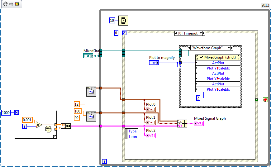
How about a graph mixed signals?
Edit - eugh, extracted from VI and references... VI attached.
-
Graph XY - Autoscale + fixed margins
Hello
Total newb here. I am currently draw a circle on a XY graph where the RADIUS can be changed, so I have the x and the y axis set to "Auto scale". However, the autoscale makes the edge of the circle go right up against the edge of the high, low, right and left of the plot area limits. I would like to add a 'margin', mainly for aesthetic purposes, so there is a certain fixed amount of space between the traced circle and the limits of the area of the plot. Hope it makes sense. I enclose the photos that I created with autoscale OFF to try to help illustrate what I'm after here. Any help or advice are appreciated.
Kind regards
Doug
Hello Doug,
You should be able to add a space of memory buffer by activating the option "Loose Fit" in the >>(x,y) right click menu of the scale. This will be round the autoscale to multiples of the scale factors 'Multiplier' their value set in the property window of the scale.
Of course, you will still need to make an informed decision about a multiple what good would be, and it depends on the range of sizes you will need to display. If you need to go more granular or dynamic that allows (for example, always scaling the chart in 1,05 x the radius of the circle), then Yes, you will need to use the nodes property of graphic range.
Kind regards
-
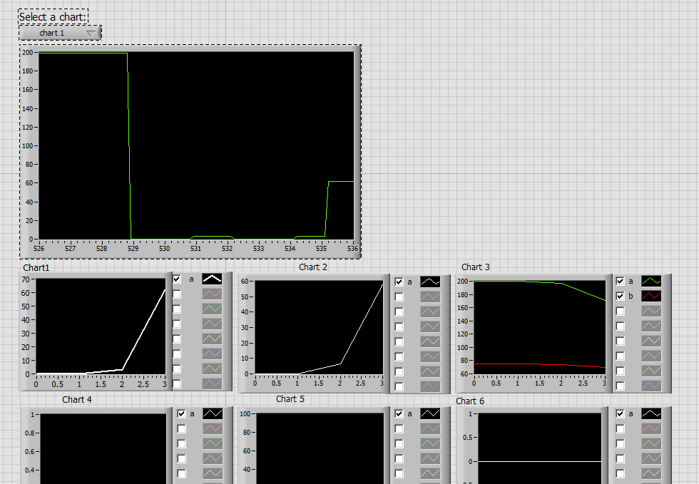
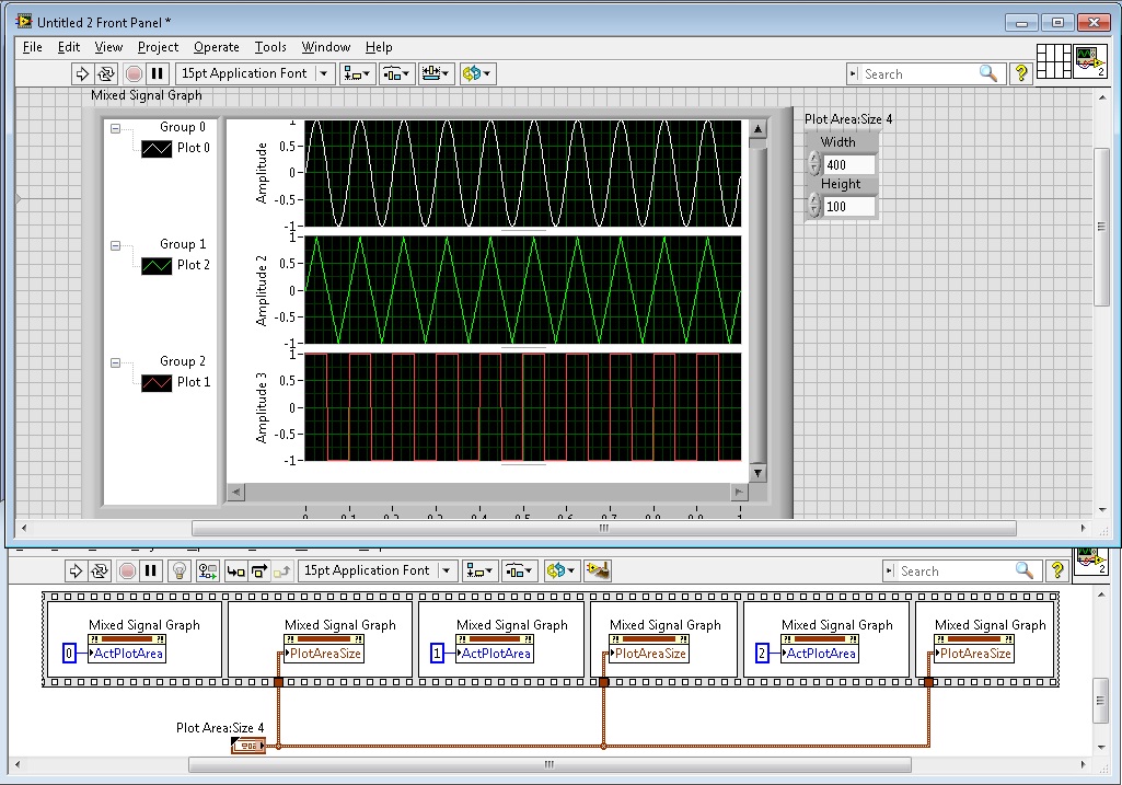
mixed-signal graph size automatic
This seems simple, but is there an option that will automatically format all the graphs on my graph of Mixed Signal to the size of my VI? For example, if I increase and decrease the size, the graphics remain a constant size and I would scroll to see them. Secondly, that all graphs have the same vertical height, instead of me manually by dragging the separator to try to make all equal in size?
Right click possibility and also space all the graphs and auto fit all graphs would be very practical! I can't find the option for her.
Image attached showing the spacing I'm talking about.
Thank you!
Hello
This can be done programmatically with the nodes property. The trick is to use two nodes of different property of the to do.
We must first define whatever parcel we want change to be the active plot by using the Active plot area property node. We can then define the limits of this plot by using the node property parcel size of the area, which is located under plot area > size.
Good luck!
-
Curve fitting non-linear with string formula
Dear members,
I'm working on a curve nonlinear vi using the formula string. Installation is fairly simple (Y0 + A *(X-X0) ^ 1.5). I can provide Y0 and X 0 values for the initial settings very good (from graph), but an initial value of A, is indicative. Adjustment turns out well, but it is not iterate the initial 'A' setting at all. Rather, he travels the parameters X 0 and Y0 and returns the same value of A, as shown in the initial settings.
The vi and a data set is attached. The best parameters of adjustment of the original software, I found are A = 11310, X 0 = 0 and Y0 = - grades 4-6. With this as the initial settings, you can get the perfect fit. But if you change the value of 'A' of the initial parameter to 14000, he returned always good fit, but returns the same value for a better fit parameters.
I wonder if I'm doing something wrong. Can someone have glance on my vi?
Dear Nav21,
I watched your VI. If you set the tolerance of the cluster of termination of a lover (1e-14 for example) value, the 'A' results will be different, closer to your optimal value.
Daniel
-
Introduction to the tutorial of curve fitting - curve example of non-linear editing
As stated in my first question, I asked yesterday I'm new to labview and I always work in the curve editing tutorial, but I am now up to the non-linear section (although I jumped the polynomial stuff for now). So my question now to do the with the vi illustrated in Figure 14 of the Introduction to the tutorial Curve Fitting.
My problem this time has do with graphic design for data non-linear Gaussian and adapt. Looks like it gets its data from a cluster of some sort which is itself drawn to clusters separate construction. The problem is that I can't find the appropriate function of cluster, which will result in the production of a graph. I had a test using a variety of different cluster functions and also have a look to try to use a matrix function and none of them work. Now, an assumption that I did is also that the graph is of the form XY (and not a waveform graph).
Note that I am aware that part of the problem could be my lack of experience in coding using labview, as I've attached the vi that I worked on.
I'm using labview 8.6.
Thanks again for any help.
Do not use the function you are using. Use the cluster on each plort bundle, then build the table of these 2 groups.
To the Subvi, you right-click the entry that caused the broken arrow and choose create constant.
Whenever you have a problem trying to find the right data type into a Subvi. Do a right click, create constant. Now, you will have a default constant of the correct data type that you can modify as needed.

-
several curves with several ladders on the same graph
Hello
I am currently working on a project that include an acquisition of data VI. I want to display two curves with two different scales (0 to 1 and 0 to 200) on the same graph.
I tried almost all the options in the Properties menu, I can't find something that fits what I want.
Do you know how to do such a thing?
Thanks in advance,
Gabriel.
Right-click on the existing scale and click on duplicate.
EDIT: I would add that you need to set ActYScl via a property node to switch between the scales of the difference if you want to perform operations on them.
-
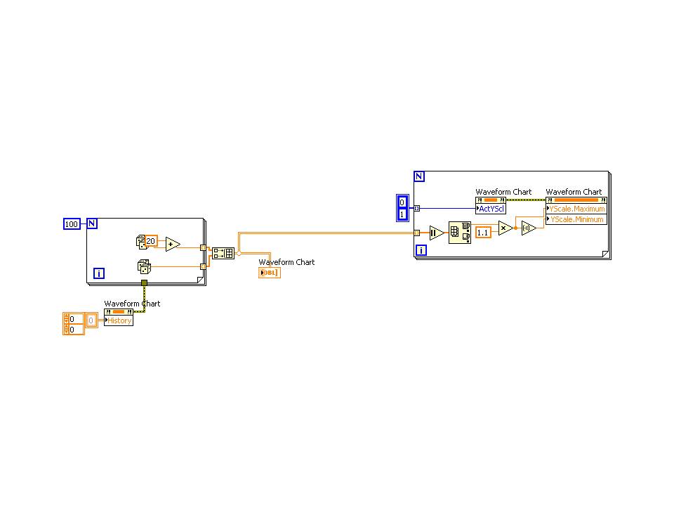
Aligning a zero position on a graph with several scales & Auto scale
Hello!
I hope it's a quick - but google searches and browse the forums nothing have mounted.
I have a graph with two scales - a position and a speed (which can obviously differ from each other). I want to be able to do is to have the scale auto chart/scales - but for the 0 position to stay in the center of the chart. With 0 balance point to different places, this is the graph that is very difficult to understand at a quick glance.
If you see the attached screenshot - the positions of two 0 are in different places.
Is it possible to have the scale automatically, but for zero to stay in the center of the graph for the two scales?
Many thanks in advance,
Sam
(As I know) you can't do this with auto scale.
Disable the autoscale, and then manually set the interval to be symmetric compared to zero for each scale.
Find the maximum of the absolute value of each table of marks. Then put it away on + and - of this value. (in the example below, I did a loose fit by multiplying by 1.1). Since you have more than one scale of the axis, you need to browse to treat each of them at a time. First of all, he must be told what balance Y you want to adjust, then, set the values.
Another option would be to have align the zeros, but not that the scale is symmetrical around them. You can do that too, it takes just a little more math. I would like to know if that's what you want.
-
Dynamics and 100% width of the HTML5 graph in apex 4.2
I have problems with the size of the HTML5 Apex 4.2 graphic.
Apex engine generates a call like this before the end of the page:
(function() {apex.widget.chart ("R2294624206389386", {"type": "SVG_ONLY", "width": "800", "height": "200", "regionId": "2294624206389386"}) ;})}) ();
He gets out of #GENERATED_JAVASCRIPT # of page template and in turn creates the graph.
Due to being wwv_flow_flash_charts_5.chart_width of digital field, there is no way I could successfully enter and save value '100%' for the width of the graphic, so my card ever gets developed to fit the container div element.
Does anyone have a portable solution for the same problem?
Height and width of the graphics leave empty.
Although these areas show a necessary asterisk, they aren't required more.
Now, the table should automatically adapt to the size of the screen. My tests have shown that it doesn't work very well according to the models are used.
Just try it, hope you lucky ;-)
Kind regards
Peter
-
Change the background color of the slide show full-screen when the option fit content proportionally
I signed up for a demo of Muse and I must say that I am very impressed. After using Dreamweaver in the past in school, often get bogged down in the code, Muse is a designers dream. I even told a few friends about it, calling for «InDesign for web designers» The features and tutorials on Adobes site, are fab but I need now to a little help.
I want several images to fit the entire screen on a specific section of my Muse site, just below the navigation bar. I noticed the best way to do this is to create a slideshow full screen. With this option I can add one or more images fade in and out - communicate various messages and points of sale. By default, as the widget options are defined in the charging framework, which extends from my image to completely fill the browser. Unfortunately with this selected the image loses some quality and seems to zoom in, getting cropped in the process. When you change the settings to adjust the content proportionally everything looks great. The chart is smack bang under my sailing as I desire however there is also a horrible gray area each side because the graph is now its original size. Grey on each side seems to be the background color of the slideshow, but I can't find a way to change this - from grey to black. Please check the link for more information: https://dl.dropboxusercontent.com/u/50403221/Screen%20Shot%202014-08-14%20at%2018.00.34.pn g
If any colleague Musers know of a way around this? Or maybe it's an enhancement request?
Thanks, Chris
Hi Chris,
You can select the slideshow widget that you added and check the fill color in the control panel.
Please refer to the following screenshot:

Kind regards
Akshay
-
How to rotate and turn the bar without distortion graphs?
I have a horizontal bar graph and I want it to have the same form as a pie chart that I as a backdrop.
What I do everything first, it is to rotate the graph (after the converted in an image) at the right angle, depending on where it should be positioned. After that, I use the-> deformation-> Arc to make it fit in the same form as the pie chart. But when I do these processes (in any order) I get a distorted image, with lines describing not concentric lines (not like Ray, I mean).
I got the perfect shape, works on a MAC, but now I'm working on PC. How can I achieve the same?
I enclose a picture descrbing what I tell you.
Thank you very much

Problem is that you turn. You could apply the distortion to the horizontal chart, then make a symbol and then turn. Or: create a brush and apply to a curve.
-
Anyone know if it is possible to create a chart "spline" in JFX: http://www.fusioncharts.com/demos/gallery/#spline-and-spline-area
Basically a graph in curves, but with curves between the data points for him give a fluidity?I think it's what Jasper recently blog on? http://fxexperience.com/2012/01/curve-fitting-and-styling-AreaChart/


Maybe you are looking for
-
Sign of the error: well, it's firefox miscegenation is struggling to recover your windows and tabs
Firefox came not upward with his window well just the sign of error.
-
Satellite 4000CDS startup password
HelloI have an old Toshiba Satellite 4000CDS that is similair to the version of CDT, I think that apart from the LCD screen.But a startup password, when I turn on there, i get the screen "in touch with tomorrow Toshiba", just after a black screen wit
-
Functional Global run from Source executable vs
Hello... Imagine a Global functional simple (shift registers loop not initialized on some time with the internal Structure of a case Set/Get) where, in a case I run the source code and I use the setting mode to enter data in the flowing shift to the
-
Hi all I have a sansa fuze for 1 year and a few days ago I decided to use a micro sd card to upgrade capacity. My USB mode is MSC because my OS is ubuntu 8.04 and because it is easier to use... When I plug my Fuze, I see 2 HDD: my rocket and my card,