draw lines on the graph of the intensity
I want to draw lines on the graph of the intensity.
I am already looking for some questions before.
I know there is a vi could draw line on the graph of the intensity by dragging the mouse.
But I need more precisely what set the length and the angle between the horzontal line.
The setting is very ideal for me. But I don't know how to use it in the intensity chart.
Is there anyone can help or give some advice?
Your example is not so great because it uses 100% of CPU on a kernel at any time, do nothing.
Here's a quick rewrite of my old example here. He draws an angle with the specified length and angle to where you click on the chart. This should help you get started. Modify if needed. (Also remember that trigonometry is much easier when using complex numbers  )
)
Tags: NI Software
Similar Questions
-
Drawing line with the mouse clicks on picture indicator
Hello
I need to import a JPG file in an image control, draw a line in 2 clicks, read bothe XY positions and perform some basic trigonometry. Any simple or striaghtforward way to draw the line with the mouse and read thos passay on the bitmap (positions relative pixel)?
Thanks in advance,
-
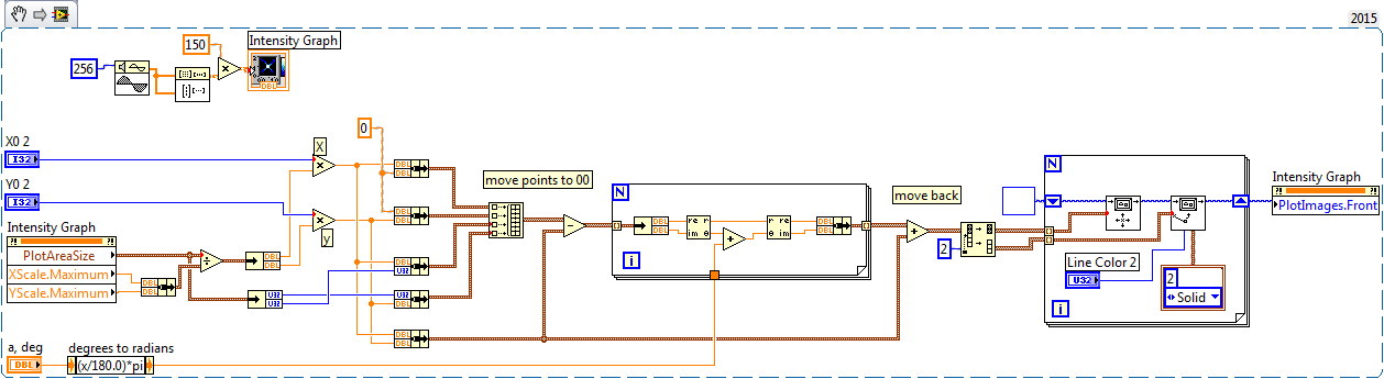
Draw the new lines on the graph of the intensity
I'm trying to attract the XY axes by an arbitrary point on a graph of intensity. I can draw two lines across the image (suite of messages like this link below), but they don't really seem FDNE to the top one the coordinates I spesify. I know that I have to correct the fact that the vertical scale increases from top to bottom, but how do I draw lines to the (x 0, y0) position I spesify? It seems that the lines are superimposed on the image, but not related to the axes of the actual intensity chart.
http://forums.NI.com/T5/LabVIEW/overlaying-XY-line-onto-intensity-graph/TD-p/398963
but you need made "vertical mirror".
-
Create horizontal lines on a graph
I'm looking to create horizontal lines on my paintings of waveform. I know that I can't use the cursors on a chart, but I want to find a way to draw lines on the y-axis of a graph (chart) of a control on my front. The reason is: I am in a position a sinusoidal signal that changes in amplitude due to the deformation of a material. I need to adjust the length of these horizontal lines using as reference.
I understand that I could use the limits of the curve because of it, but then I wouldn't be able to tell how long out of bounds, I. I am a super novice to Labview and you guys have been such a great help with all my endeavorsso far. Any suggestions?
Draw several lines in the table, where two of the parcels are borders. I don't remember the exact requirements, but you can probably do it by grouping the values or the construction of a table. Check the contextual help and the examples in the table.
-
laptop HP pavilion 17 64-bit: draw lines on your desktop
can someone explain how to draw lines on the desktop? I am currently working on a project that requires lines to be drawn on some of the pictures on the desk. to make things more complicated, I don't use a mouse, and my computer has not left and right click buttons! He has a very sensitive touchpad, so there is not to hold a left or right button as possible on most computers. so, for the moment I tenderly your help there, to try to solve this problem. If there is a solution, that is! I have to admit that this is something new for me, but you live and learn to do not you?
Thank you very much in anticipation.
Glad to hear the clicks of mouse work for you
 about the graphics program, it seems that you need something which will give you a fairly accurate line length measurement while you draw the line is - that correct? Photoshop Elements can meet your needs. In my opinion, it costs about $80.
In Photoshop Elements, while using the online tool, it gives you a measure of angle in real-time and (to the thousandth inch) length of the line you draw. Here is a picture to demonstrate:
Only a slight glimpse of the line appears while you actively draw, then the complete line appears after you release the mouse button. You can customize the line to any desired pixel width. Each new line creates a new layer 'Shape' on top of your image, which can then be resized or moved or otherwise handled, according to the needs.
I hope this helps. Your assignment seems deceptively simple
please let me know if there is anything else I can do to help. -
What should I use to draw lines on a map?
Is it a drawing of the tool that you can attach to your computer to draw lines? The cursor is not precise enough to draw lines on a map (jpeg). Is there a tool I can buy and fix to draw on my screen using PS?
Thank you post again - I recommend no doubt using the pen for what you are trying to do. Trying to map free hand lines is very difficult, but the pen tool offers precise control. I have outlined some steps for you to follow below.
1. open your image and select the Pen tool from the toolbar, as shown below.

2. I would recommend zoom in your image to make it easier for you to track on the lines of the complex plane. To do this, select view > Zoom In, or hitting "control +" (Windows) or ' command + ' (Mac) on your keyboard.

3. then create a new layer by clicking the new layer in the layers panel, as shown below. Draw your lines of card on a new layer to preserve your original map image in case you make a mistake or want to start over.

4 using the Pen tool, tracing on the lines of the map of your boot image. Here I begin to Bellevue and suite I90 to Ellensburg. Using the tool pen takes some practice. To get detailed help about how to use the pen tool, watch videos of Terry White I linked in my previous post.

5. Once you have finished tracing over the lines of the map, go in the tracks Panel by clicking on the "Paths" tab in your layers panel.

6. in the tracks Panel, click the icon of the path highlighted below. This caresseront the way you created using your most recent Brush tool settings - I will go into this more again to the next step.

7. you can see that the way that I created with my pen tool has been rubbed with yellow and aligns very well with the original line of the card. You can change the size and color of your run by selecting the Brush tool in the toolbar and clicking the tools described below.

8. when I have to zoom out, you can see I have drawn precisely the line of the card. I did it very quickly so with patience, you can create extremely accurate map lines.

I highly recommend watching the video of Terry White on how to use the pen tool. The pen tool is the best way to create very relevant and precise lines apart from the purchase of an external drawing tablet.
I hope this has helped! Good luck!
-
How can I specify pixels in the graph of the intensity?
Hello
I want to specify the number of pixels in the in the intensity chart. I have 56 values want to display. How can I do this?
Hi jerryvdk,
By specifying the number of Pixels, you hear, allowing only a specific land area size of the chart itself?
You can change this through the use of a property node.
Steps to change the plot area size:
- Right-click on the graph of the intensities.
- "" "" Scroll create "property Node" plot area "size" all items.
- This will create a property node that will allow you to change the property of area of the draw of the intensity card.
By specifying a space of draw of the 56 x 1, this would allow a 56px draw area size fate. Is that what you meant?
-
With the help of the graph of the intensity
Hello
Currently, I have a problem with the graphics of the intensity. I use the Toolbox of the time frequency in Labview. Currently, I am having a problem where I had to plot the spectrogram of the signal. I tried to maintain a plot of the spectrogram to 0 for 4S and another 4 s to 8 s. I'm trying hard to draw the graph of the two together, to form a parcel from 0 to 8 seconds, in the spectrogram. In addition, the time axis will continue to increases in 4S interval with a spectrogram updated. I wonder how can I realized by having two spectrogram with two different time interval to display a common conspiracy? Thanks much for the advice.
RDG
kengkc
Hi kengkc,
Correct me if I'm wrong, but you say that you have the data for the first 4 seconds of your acquisition (t = 0 to 4) and 4 seconds following your acquisition (t = 4 to 8) and you want to combine them into a plot? I guess that since you were able to draw in a graph of intensity to begin with, they are already in the tables.
If that's what you want to do, you can easily concatenate your arrays using the Array function build (which means to add a table at the end of another person). Add your function Array of build of the subpalette of the table and make sure that you right-click and choose concatenate arrays so that you get more dimensions in your resulting table. Then expand the function Array build so that you can wire your matrices inside.
Please refer to the attached screenshot to get an idea of what I mean.
I hope this helps.
-
How can I draw the intensity in real time of a picture in time real (imaq 1394)?
I have a firewire camera.
I hooked up my camera to my pc with labview and now I display image in real time. How can I draw the intensity of a region dependent on time?
Y - intensity
X - time... I would watch the variaions real-time intensity...Thanks in advance
The light meter example is pretty much what you want to do. It is located here:
\National Instruments\ \examples\Vision\2. Functions\Light Meter\Light meter Example.llb\Light meter Example.vi In the example, the x axis are the number of iteration, but it is easy to modify to use a graphic instead of a graph and chart the time instead.
Hope that helps.
Christophe
-
How to use the graph of the intensity in the iPad data dashboard.
Hello
I use a graph of intensity in my vi main under a project of myRIO.
I created a shared variable of the 2D array. When I selected the variable in the ipad it does not show that he presents in the pc...
I want to mention that I have selected the multiplier as (= 30/255) 0.117647 in labview in pc
I use the version of labview 2015 myRIO.
and I am using iOS 10 in my iPad
can someone help me please
Hi adil,.
The graph of the intensity is not supported in the dashboard of data.
Kind regards
Denny
AE Singapore
-
DateTime on x-axis of the graph of the intensity
How can the x-axis of a graph of intensity be configured to the DateTime data type, similar to the graphic waveform XAxis? You can set the FormatString DateTime MajorDivisions, but has no way of installing the x-axis values. Waveform curve has a foot (double [], DateTime, TimeSpan) function that will implement the XScale with the correct DateTime values, but the graphic intensity doesn't seem to have a similar capability. I tried to configure the graphic intensity YAxis MajorDivisions DateTime Format string and pass then the plot function Tick values for the yScaleStart and YScaleIncrement, but it does not work probperly. MS2012 release notes say that the curve of intensity has now an automatic formatting for displaying DateTime on axes X and Y. I tried to use this feature to test the DateTime X and the ability to axis Y; However, the function of automatic formatting is not available for the chart of the intensity. Any help is appreciated.
Thank you!
Jon
Hello
Try the following code piece.
            // Set the label format correctly            intensityYAxis1.MajorDivisions.LabelFormat = new NationalInstruments.UI.FormatString(NationalInstruments.UI.FormatStringMode.DateTime, "g");
            intensityYAxis1.Mode = NationalInstruments.UI.IntensityAxisMode.AutoScaleExact;

            double[,] data = new double[100, 100];

            for (int i = 0; i < 100; i++ )
            {
                for (int j = 0; j < 100; j++ )
                {
                    data[i, j] = (i + j) / (colorScale1.Range.Interval * 2);
                }
            }
            // IntensityGraph only understands double values. But graph can interchange the data value from different types using the DataConverter provided by NI.
            intensityPlot1.Plot(data,
                0,
                1,
                (double)DataConverter.Convert(DateTime.Now, typeof(double)),
                (double)DataConverter.Convert(TimeSpan.FromDays(1), typeof(double)));
It will be useful.
Habim stone
National Instruments
-
I have a chart single 2D out a conditional of a loop indexing output such that over the rows of the table are not the same size. -Basically, they have different starting and ending points and sizes. -Not so concerned by the endpoints, because as soon as I get correctly starting points, everything shows fall in place.
The challenge is that when I try to have the variable t0 (start time) for each line, the wave of construction vi form would always keep each line at the same starting point.
I used the approach bundled with success (the cluster approach ensures that each waveform starts at different times according to the guidelines of my t0 defined for each line) but then I'm not able to get in the channel names I could make using the graphical approach (wave generation) waveform.
In essence what I get here, I'm losing here.
Because I don't want one of my mentors, Bob and Altenbach have fed up with me I have attached a vi this time

Attached VI shows a combination of the two attempts (first with the waveform graph) and then with the graph of cluster
1. with the first (graphical waveform), I get my channel names as you wish, but the alignment of the wave is not correct.
2. with the second (graphical cluster), the alignment is good, but I can't do the names of channel in the chart, even if they are present in the cluster.
I read some reviews that mentions that attributes can be displayed with waveform and data Dynamics (not clsuters) so I guess that's why.
I saw another report indicating the start time for a waveform 1 d will always remain the same for the rest lines defined for the first line even if changed for the following lines in a loop.
So I guess my question is: what is the way around questions like that?
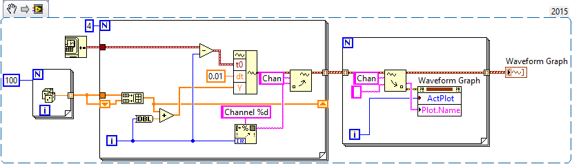
First of all, let me be the first to the congratulate and thank you for finally posting a code! I'm not 100% certain I understand your question or your code, but I have an idea, perhaps, of what you want to do, so I wrote a little VI who made something simple that could be relevant.
You mention waveforms of different lengths and beginning at different times. You also want everyone to have a unique attribute (although I'm not sure what you want to do with the attribute). So, I did the following:
- Generated an array of 100-sample random to represent one second of a waveform.
- Created 4 waveforms on this 100-sample basis. The first waveform (channel 0) is just these 100 points. The second, 1 channel, is the concatenation of string 0 with the base of 100 samples, or a waveform "double". Channel 2 is 1 string concatenated with the base, and channel 3 is 2 string concatenated with the base.
- In order to trace the four channels that they rest 'on' the other, the waveform has the number of the channel added to it. Channel 3 is 3 + (4 copies of the basis of 100 points), a waveform 400-point random centered around a shift of 3.
- All channels have dt value 0.01 (but I guess I could have varied, as well).
- To make the channels start at different times, I started channel N N seconds before channel 0 (by subtracting the index of the loop, I, T0).
- For each channel, I created an attribute called "Chan" equal to "Channel N" (where N = 0, 1, 2 or 3, as the case may be).
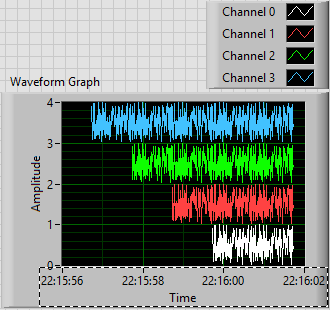
This is the plot that results. Scale X is the absolute time value (no Date) using the 24-hour HH: mm
 S format. You can see that the plots are 1, 2, 3 and 4 seconds of time, and are offset from each other by a second. I used the trace attributes to change the name to the respective attribute.
The code to do this is very simple - I almost don't need to show it, because I think it is completely described by the text above, but this is here:
Now, it was not that much faster that some of your previous posts, when you refused to your postcode, "guess us" what you wanted (but not to not correctly guess), you tried to "push" us in the right direction (still refuses to post code), and no one seemed very happy?
Bob Schor
-
Hi all!
I'm using Labview 8.6, but the file is saved in labview 8.5.I'm almost done with this mission, but I can't understand how to draw a tangent line at the top of the chart with the derivative of the function.
Can someone help me please?
Thank you
LabVIEW file:
Analysis of the assignment:

Hello
here a solution how to add Ct to C
Concerning
Tinnitus
-
draw lines parallel to the y axis in chart
I want to draw lines on a chart programmatically.
In the attached vi, I displayed a histogram chart.
I need to draw two lines parallel to the axis y places different x axis to show the bounds / range of values.
kindly help me in this.
Thank you in advance.
Maybe two sliders?
-
URGENT magic wand tool selects a line drawing, instead of the space between
Hello
I am coloring/rendering a map of the places where I imported a PDF of line drawing prepared in Autocad. To do this, I usually start with the magic wand tool to select areas on the plan and block everything with the pot of paint color. However, this time when I select objects (say the building) selects the black lines in the layer (the line drawings) rather the space between the two. I checked to see if all the lines are closed and I played with the tolerance but he still picks on the lines instead. I tried both on a transparent background and tried to merge the lines with a layer of white background but without success.
Please help if you can, I have a tight deadline to finish it and use the polygonal selection on everything that would be both pain and take too much time! I have Adobe Photoshop CC 2015.
Thank you.
If there is a problem with gaps - create a copy of the layer. Apply a 1 - 2px Gaussian blur. Use the magic wand on this layer, then make your choice.

Dave


Maybe you are looking for
-
HP 8300: My motherboard supports 95w TDP?
Hi people. Does anyone know the specs of my motherboard? (The HP Elite 8300). I would like to know if it supports a 95w TDP. The HP Elite 8300 has a card mother "Hewlett-Packard 3396' and is currently mounted with an i7-3770 (which has a 77 w TDP). I
-
Is there a simple way to check if a numeric key?
I have a digital controls control array (and I want to keep it that way). I would check if the user presses a button increment/decrement. If none of the buttons is pressed, I do nothing; If no is pressed, I take the value zero. The value doesn't mat
-
My rating of "office for Windows Aero performance" graphic is 4.9, the lowest performance rating I
I have a GeForce 9400 GT Board driver version 258.96. 16 CUDA cores, 550 MHz core clock, Shader clock 1350 MHz, Memory clock 400 MHz (800 MHz data rate), 128-bit memory interface, available graphics memory total 1755 MB, Dedicated video memory 1024 M
-
Windows cannot update and cannot install Office
I can't install Office on my computer (Vista). I tried to do the cleaning of the .net, but it did not help. The computer can also install updates (error 80072EFE 80200053, 80244020). The two problems are related? I tried reset Windows Update and a
-
Unable to start Vista in a dual boot with XP
original title: a 1.5 T hard drive 3 partitions. XP to end vist Center. When it is installed vista it does not start XP. I had xp pro on the end of the disc hard and then installed vista professional. At boot, it gives a selection vista or windows m