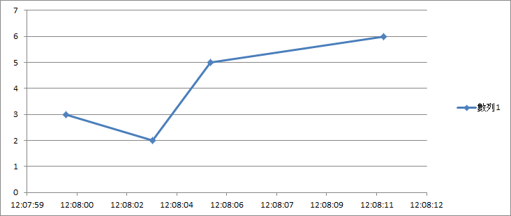
XY graph with matrix Boolean
Hello
IAM facing a little problem here... what iam trying to do is basically convert a xy chart in a table of Boolean (no matter if it is in a table or graph)
I did a sketch in photoshop is easier to understand.
xy graph: boolean array:
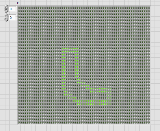
any idea on how to do this?
Kind regards
Oli
Initializ a Boolean array of the desired size and put it in a registry to offset. iterate over the xy pair, map coordinates on the array indices and use replaces the subset of the array to light the LED at this level. Repeat for all points.
(If the points are relatively remote and you need create lines of interpolation, you would add a little more code)
Tags: NI Software
Similar Questions
-
Problem with matrix/screen in Qosmio F55-Q502
Hello
For a few weeks, I have a strange problem with matrix/screen of my laptop.
The matrix flickers very often - no matter if the power cable is plugged in or not.
The screen is full intensity and all of a sudden it starts flashing - it gets darker, lighter, usually for a few / dozen seconds. It does when no one touches or when I'm working on it.
This very annoying and making eyes tired - he does it very fast and there is few levels of screen brightness.In addition, sometimes the screen turns off - you can see what is on the desktop but the screen is very very dark (but not empty or completely off). No reason - sometimes just in the workplace, sometimes for example when I touch (not pull) the power cable between the laptop and the power supply.
Then, the only way to return to normal brightness of screen id to close the lid just for half a second and open it
-matrix comes on normally, but can 'turns off' moment later and I have to do it once more - sometimes even several times...
After 'action' with cover screens it seems that nothing ever happens...Anyone an idea what is the cause of such behavior or how to diagnose in details?
Or maybe solve this problem?Best regards
300 mSounds like the backlight or inverter fails, or there is a bad connection.
Is the unit under warranty? Send it to an ASP for repair.
You should avoid to repair yourself, the backlight is very high voltage!
-
the exact position of the mouse click xy graph while he plotted graph with mouse events
Hello
IAM using Graph xy for multi locations
IAM traced graphic with mouse movement and events using the example attached (draw the graph with mouse events)
but in sub vi Values.vi scale there are two constants 66 and 30 when I change my plot (I also change the scales), then the mouse position and chart position (cursor) value are not well aligned, but when I change the constants mentioned above I get the alignment perfect between the cursor and the last point in the path.
as I went to another parcel (with scalability again) the same alignment problem resurfaced.
I need to replace these two constants with something dynamic
Please help

concerning
Mazhar
solution to my problem is
-
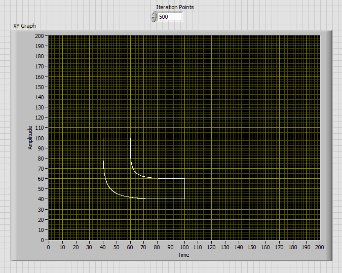
Aligning a zero position on a graph with several scales & Auto scale
Hello!
I hope it's a quick - but google searches and browse the forums nothing have mounted.
I have a graph with two scales - a position and a speed (which can obviously differ from each other). I want to be able to do is to have the scale auto chart/scales - but for the 0 position to stay in the center of the chart. With 0 balance point to different places, this is the graph that is very difficult to understand at a quick glance.
If you see the attached screenshot - the positions of two 0 are in different places.
Is it possible to have the scale automatically, but for zero to stay in the center of the graph for the two scales?
Many thanks in advance,
Sam
(As I know) you can't do this with auto scale.
Disable the autoscale, and then manually set the interval to be symmetric compared to zero for each scale.
Find the maximum of the absolute value of each table of marks. Then put it away on + and - of this value. (in the example below, I did a loose fit by multiplying by 1.1). Since you have more than one scale of the axis, you need to browse to treat each of them at a time. First of all, he must be told what balance Y you want to adjust, then, set the values.
Another option would be to have align the zeros, but not that the scale is symmetrical around them. You can do that too, it takes just a little more math. I would like to know if that's what you want.
-
bar graph with two scales of y
Hello
I have a graph with two scales different (one on the left side from 0 to 50, the other to the right of 0 to 1)
Now I want to draw horizontal lines limit. I do this with the programately adjustment sliders.
But I can only put the sliders that "belongs" to the first scale.
Is there a solution?
Thanks for any help
Yves
LV 8.6
Hi Yves,
You can assign each slider to a YScale. Simple right click on the cursor and choose the YScale. I think you can also do it programmatically.
-
First HP: Lack of Sections of first graph with steep slopes on HP
I saw somewhere an old post on the Internet where a user was having difficulty to see the graph of y = x ^ 4 (x-2)(x-6) using a "Decimal point" display window and the "Evolutionary" method in the application of the function. The chart has not demonstrated the branch of the chart with the x origin of (6, 0). The response at the time was to use a different window or switch to advanced graphics application. I don't like either of these options, because much cheaper calculators have not this problem.
With a little experimenting, I found that the calculator will be graphic curves where the absolute value of the slope (derivative) is less than about 375 * (Ymaximum - Yminimum) / (Xmaximim - Xminimum) where the minimum and maximum levels refer to the values specified in the configuration of the land. When the curve is steeper than this amount, the curve has holes and gaps until this value exceeds of approximately 1500 *(Ymaximum-Yminimum) / (Xmaximim - Xminimum). At this higher value, the curve is usually not in graphic form at all. These expressions are based on the study of graphs of the polynomial given above, y = 1 / x and y = e ^ x for different values of configuration of land.
I realize with the option of touch screen on the first HP for the graphics window resizing, calculator, developers should be a little more sophisticated in how to get the calculator determine the graph. The current 'Adaptive' method is too risky for me to use unless I know a little on the chart. And the graphic progress is too slow. HP working on another option or is there maybe a setting on the computer I do not use its full potential?
I've only used the calculator for a few days, but others who have used the calculator for many more are also puzzled. Thanks for any info. You can send our way.
It is currently being considered. I can't say when / if there will be changes, however on the political basis of HP on 'future-looking '.
However, graphical representation is one of those things that is "deceptively simple" because it seems to be pretty easy but is actually infinitely difficult. It has in fact been mathematically proven that you * don't * create an algorithm to be quite accurate for the same simple algebra. All graphics engines turn example is a very simple method that collapses quickly for something else then the case of some, it's well, a series of different behaviors for different types of problems in an attempt to account for different types of situations.
The average general graphic has been done in the past was "moving pixel, evaluate and connect the dots." This works for simple things, but falls apart pretty quickly. Most of the calculators except the first on the market at the present time use some techniques of "smoothing" kind of hide the types of problems, this method can generate and generally work well for simple cases. While that hides things, the problem is he hiding things. :-) In more complicated cases, it actually makes things quite worse.
In this simple case, most of the systems actually get the "right" result because they always assume that a big jump in values one line drawn to connect them. Result directly in other cases where it draws a vertical line to an asymtote that shouldn't be there. That's why things like Tan (x) go very often vertical asymtotes where there shouldn't be any. To try to avoid this, you need the code to make a special analysis in the case of start trying to filter false positives. It seems that in this case, it is bad filter and eliminate the line here.
For another thing of pleasure, try the example simple "sin(e^x)" on all your systems. You will get some pretty crazy things and strange patterns here where there should not be any. The "speculative", the first will be closer, but only the grapher advanced with its graphics of interval it gets correct.
So in short, yes - you put this to our attention. In long, graphic representation is in fact much more complicated then one might expect. :-)
-
Increment and decrement with a Boolean value entered
Hello Experts Labview (and in fact life savers!)
I have a digital controller (button) in my VI, digital indicator, in addition to a Boolean of power input.
As an initial state, the digital display will contain a certain value (zero for example) and will only receive the variation in the button entry as long as the Boolean is true, and then add it to this initial value.
What is the change ? lets say that the button was on 8 before I touched the Boolean true, the value of the indicator is zero, and then I hit the Boolean true.
Now, when I move the button from 8 to 18 years (variation of + 10) , I want to receive the indicator + 10 and add it to the zero, now the result is 0 + 10 = 10
Now, the value is false, I move the button and nothing happens to the in the indicator 10.
Now, the Boolean value is true once again, let's say the button was about 4 at the time, I hit the Boolean true and it spend 4 to 1 (change-3) , the indicator value will now be 10 + (-3) = 7
I hope I explained the idea in a clear manner, I would be very grateful if someone could help me with this.
P.S. I have attached only the vi to illustrate the idea.
Thanks in advance
You care only remarks how the button changed. Therefore, you must subtract the old value and the new value to get how to change the button. Then add inside the structure of the case, this difference to your value that belongs in the registry to offset.

-
Hello
I want to do the following:
I want to generate random numbers in a single column on my table and the second column with the date and the current time. Then I want to plot only the random number sthat have been generated with TIME to Get Date/time function. I want to put this in a picture and draw with a XY Chart rather than in a worksheet. I am stuck and would appreciate any help.
Side note: for my purpose, I want to get the time exercise, rather than using a waveform chart and use the clock internal to this vi.
Thank you.
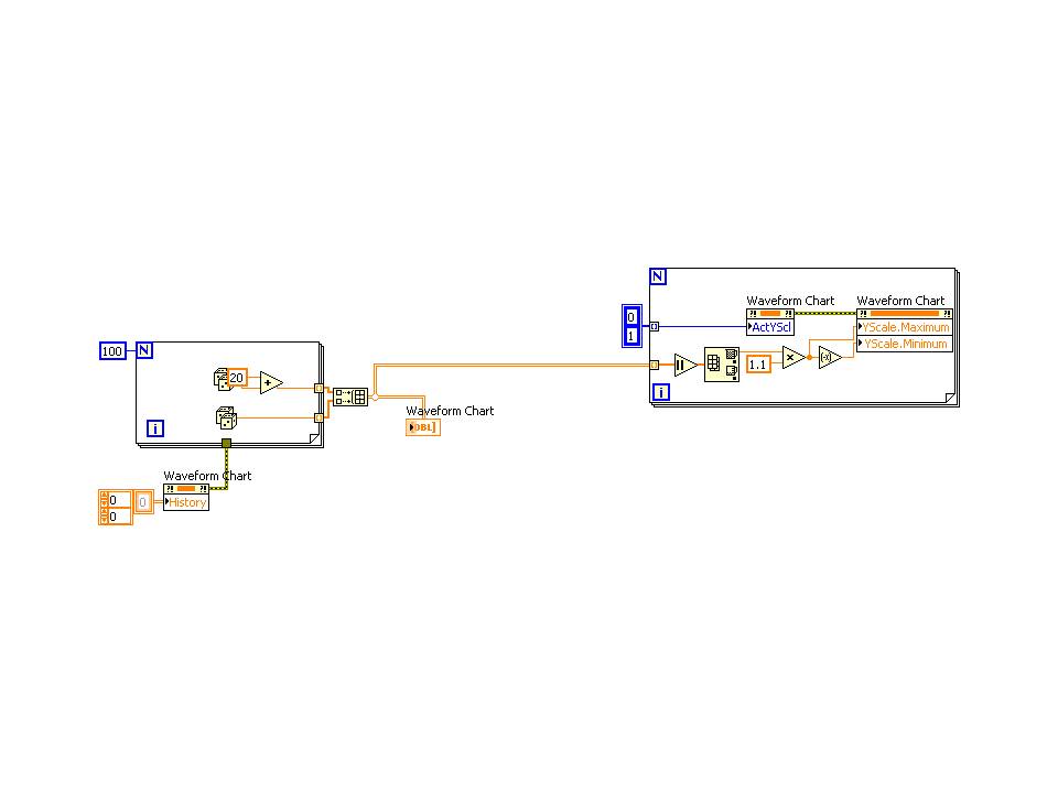
Don't use do not LV2013 here, so do not know what you have tried. But if you use Get Date time in seconds, you will find that the timestamp that is generated can be used to plot against your randomly generated number. No channels not involved - a cluster of timestamp table and the data table can be traced on a XY Chart.
For example, the following snippet generates a random number all the 100 ms, twenty times, then trace the number against the timestamp, that each of them was created in the. Right-click on the graph XY and the display of absolute time format setting allows you to customize the display of your heart's content.
Edit - impossible to believe that I didn't not the sentence as "no condition". It was an open goal!
-
How to plot a graph with no fixed time interval?
Hello
I know that this question is a bit silly... but still, I would like to know how to find...
If the signal is generated randomly by time, how it chart in the chart since its interval must be fixed?
as the following picture
I think graph XY can achieve, but is not what I want because the signal is generated continuously for a long time.
I hope that data must be updated, graphic - mode this possible?
Use a fixed size queue and make a queue with loss when new data. It essentially becomes a data buffer of length defined by your queue size. To display data, use 'Get Queue Status' with 'Elements to return' = True.
(Or have fixed an array of size and have a circular index of items - but I think that the solution of the queue is cleaner)
-
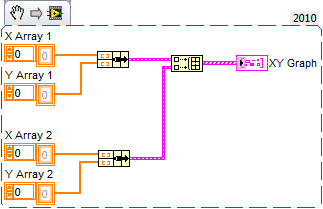
How to draw a graph with several axis xy enter?
Hello
I have problem in xy graph, the graph xy can only display 1 signal the y-axis of entry (as you can see in the attachment)
Is it possible to draw the graph xy with 2 go? Or maybe there's another type of graph as possible to do?
Note: the x axis must be an entry too (not compared to the time / sample).
Answers and advice are welcome.

Best regards
Alvin Chandra
You ask for a second scale of Y on the graph?
If so, right-click on the scale of the existing, select "Double ladder". This will create a second scale. You can then (if you wish), right-click on the new scale a select 'Swap sides' to put it on the other side of the chart.
You ask about adding a second plot?
If Yes, then you must group your arrays of X and Y points in clusters and build those in a table:
The x-axis is always an entry on the XY graph. You just need to change the title of the axis. Way easier to do is to double-click the axis title and type the new name.
Rob
-
How to fire an event with a Boolean button only when you switch on IT?
Hi, I have a problem with my structure of the event: I use a value Boolean on/off button to launch a State (using producer consumer architecture).
When I turn it on, my structure of event get "change value" and the code is executed.
But when I turn it off, the loop in the code ends, but there is a problem: the event 'change of value' is activated again, and the code is run again.
How can I avoid it? It is not 'on' or 'off' events to the event structure, only "value change.
Here are a few screenshots, thanks in advance
J.D.,
Use the NewVal Terminal in the case of the event. Who has the value of the control. If it is true, queue the message. If it is false, do nothing.
Generally, it is better to have order in the case of events and to send messages to consumers through queues. Nested loops as you seem to have can create difficult problems of what must happen when. It is unusual for a state machine need a nested loop which requires intervention by the operator. Without the VI all I can really say what you do, but I strongly suspect that there are way more robust and easier to do.
Lynn
-
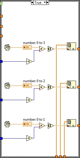
Generating unique random number with a Boolean signal on an RT target
Hello, this is my first time asking your question. I apologize if I post this question in the wrong Council.
[What I'm trying to do]
I am stable heating and cooling in an experimental space that I (with cRio9024).
And I'm putting a different experimental condition in space based on the function 'random number '.
'Different experimental conditions' sense different combinations of Tind, Twat_s and mdot (refer to the attached VI).
For example, if I get the Boolean TRUE signal.
I should have a set of [Tind, Twat_s, mdot] = [21,14,0.05], and IS this set of numbers until this Boolean signal goes to FALSE.
And when the signal passes to the TRUE once again.
I should have a different set of [Tind, Twat_s, mdot] = [24,16,0.15] for example.
[I]
Problem I am with my code is that,
When the VI is running, the random number remains the same as the Boolean signal is set to TRUE.
From what I tried so far for the last couple days, using 'the event structure' was the message more concerned that I found,
However, LabView help tells me that "structure of the event" on the objectives of the RT do not support the events associated with the user interface such as the façade of VI or controls panels.
I would therefore ask a quick help, since my knowledge of LabView is exhausted at this point.
This is so the part where I want to generate random numbers, WHEN this structure case is TRUE.
convert whole numbers, random numbers
Use them as a table index,
while I can choose conditions from radom to the given set of conditions.
Once more, I want to do is,
generate a SINGLE random number series when the structure above is TRUE.
Hope I have developed quite clear.
I'm appreciated for any kind of advice.
Thank you!
You just need to store the Boolean from the previous run. Then the logic would be (I'll call her Boolean previous B_prevand current boolean B):
If B AND B_prev > don't generate new values
otherwise if B > generate new values
Edit: to store your Boolean value, you can use a feedback node, or a loop with N = 1 and a registry change.
-
I want my table to have a constant slope already mapped out before she continues start tracing data in real-time... so that I can compare my new data point to point with the ideal slope that I already have in the background
Hi raza,.
as I said: it is not a problem to have two plots on a graph. But you need to use a graphic instead of a chart!
Like this:
have a constant ground created before the loop and a variable field created in the loop!
-
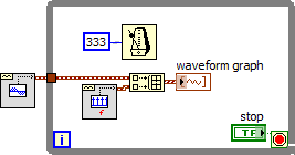
Change the graph with nodes of property
I've been struggling with this problem for a while now. I have a graph of simple waveform I want to set the horizontal scale to and then make a .png to file. The vi is attached. This vi is up to a lot more great vi. Does not work when I run the first level vi of the adjustment of the horizontal scale. The .png file I receive shows the unadjusted graph. However, if I open this vi and then run the first level vi it works - the graph shows the .png file scale properly. Also, if I just run this vi se it works correctly.
I'm guessing there is a timing issue and the .png file is created before the scaling takes place, but I don't see how.
Does anyone have any ideas as to why the scale does not if the vi is not open, when it is executed?
If the front of the VI is not open, the nodes property can do nothing because they run in the UI thread. This is consistent with the behavior you report with it works when the VI is open.
Can you try to open the façade but putting off the screen (if the user does not see it) and then set the properties of the graph?
Lynn
-
How to plot graphs with a different number of values
Hello guys,.
After a few hours, I have to give up and you ask for help.
The problem:
It must be possible to disregard some of the measured values. The measure and valid points should appear in the same graph (for example, the measured values of 'x' and valideded 'o' data. Valideded data would look like a circle with an 'x' in the middle).
So far so good.
The time difference between the measured data (dbl-table) is always the same (20-30 seconds).
I tried (see attachment):
If the measured value is not valid, I delete this value and change in this case the 'dt' in the waveform (see loop 2), if I get the data I want.
I tried different ways, but I can't to plot the data in a single chart (I think because the timedifference 'dt' is not the same)
You have an idea, how can I draw the graphs shown in 'graphic linear adjustment' and 'validated card data' in the same chart?
Maybe I need to use the "graph" and not "table"?
I chose graphic because it must be possible to hide/show each plot (but me, I'd work with graph as well)
I hope I described the problem well and you can help me. I'm sure, it's possible and probably easy, but I'm not

Thank you!!
Hi Alex,
do the old trick of NaN -
 !
!
Maybe you are looking for
-
Since I got this new computer with windows 7 I can NOT download the updates or even to play purchased games that require download... What is the dea? someone told me that windows 7 is to blame
-
Why Conime.exe pop always upward after as I try to remove it from my system configuration startup programs. How can I get it permanently deleted? If I remove any startup program, it remains deleted. Why not Conime.exe. ? How is it is not located in t
-
I have a (relatively recent) connected to a PC and a Mac Wireless Officejet 7110. I cannot print envelopes #10 through Microsoft Word (or any other software) on each side. I have tried different brands of envelopes with different paper thicknesses. W
-
try to change the wallpaper image
When I try to change my desktop background or wallpaper, that nothing happens, nothing changes
-
low cannot load program in Windows 7
~ I have window 7 and impossible to load all pogram