change the dt on a waveform graph
Hey guys,.
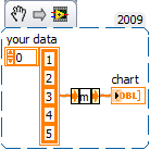
Im trying to create a graphical representation of the temperature over time, currently using a graph in the form of wave. I want the user to be able to select the interval that the temperature reading is held and the level which is considered to be a noteworthy event. I have the level and random data by plotting the curve on the same graph, which is a start, now I'm trying to get the interval between readings to reflect in the axis of the x.
I see the graphic waveform always incriments by any reading, this works very well if the measurement interval is one second, but if the user selects 2 seconds I want the next value on the x axis for incriment by two.
I found something that has a value of Y and a value of dt (waveform of the construction), I'm sure that im using wrong by sending a single value at a time. is there a way to do what I want to do?
Ill post a screenshot of what I have, thanks for any help
Ben wrote:
Tags: NI Software
Similar Questions
-
How to change the accuracy of output waveform and spreadsheet graph data acquisition
See attached vi, data acquisition connects to a waveform graph in a spreadsheet. I want to change the precision of the output of Wizard DAQ 6 decimal places with 2 decimals, but everywhere I looked on the DAQ assistant, I can't find a control accuracy. I missed something? What is the elegant way to do this?
Thank you.

Hello sunflower.
This seems related to this question...
Why do you want to change the output of the DAQ assistant?
Should not change the precision of the creation of the worksheet? To do, simply give a few parameters for the functions "to the string conversion..."
Outside the file save all the other screen precision parameters are just cosmetic measures!
-
How can I change the data used by a graph of a waveform depending on which tab is active?
Hello
First of all, I want to say thank you in advance! Let me describe the situation a bit. My front panel VI (see attachment) has a tab control and on each tab of the window, I have a graph of intensity with a free drag cursor. On the tab control window that I try to display the row or column of data where the cursor is, I can do this for each in the intensity chart individually. I'm trying to clean up the block diagram a bit and instead of using 4 waveform graphs, I want to use one, can the data that is displayed in the graph of the waveform are associated with which page is active in the tab control. Is this possible? And how can I do?
Thank you once again,
~ Daniel DeWitte
Thread just the terminal tab to a case structure, switching data going graphic terminal
(Sorry, message by phone, can not look at your code...)
-
Physical unit of the modification of the axis is in the path of a waveform graph
I would like to change the physical unit of a y axis in the plot of a graph (graph xy) waveform in the same way that I change the unit in a digital command. How can I do this? I use LV2012.01f4 32-bit.
Hi Joern,
Then, you apply a basic unit of your data before displaying in the chart:
The graph accept the numbers with unit (unlike my old message), but you must apply the unit to your data before you wire the table...
-
How to display the signal on a waveform graph in Labview Signal Express?
Hello
I want to display a signal in Signal Express 3.0 in a "waveform table", but don't know how to do it and I think that it may be impossible?
In Labview, there are two ways to view data, a 'waveform table' or a 'waveform graph. The great thing with 'picture of waveform' is that it allows you to set a length of history and you can see the data move to the left (option graphic strip) that samples are recovered. It works perfectly.
In Signal Express I can only select "Graph XY" or "Waveform curve" by doing a right-click of the mouse, but I can't select "table of waveform. Is it really true that it is not possible to view data in a graph of waveform "with Labview? (1 analog signal during streaming, 100 samples to read at the rate of 1 K)
Thank you in advance,
Enrique
Hi Enrique.
You are right that there is currently no graphic waveform in SignalExpress. The thing nearest you can join, is saved data under a log and then he looks one when recording (which I know this isn't quite the same interactive behavior).
For your last comment, you wrote 'waveform curve', but I guess you meant 'picture' here as well.
Sorry about that. We recently received this request, then perhaps in a future version.
Phil
-
Script to change the line style in a graph report
Hi all
Is it possible to automate the formatting of (linestyle) of a plot of graph in a report?
friend,
Ben
This code accesses a system of axis line style:
Call GraphObjOpen("2D-Axis1")

  Call GraphObjOpen("2D-Axis1_Curve1")

    D2CurveLineType  = "solid".

  Call GraphObjClose("2D-Axis1_Curve1")

Call GraphObjClose("2D-Axis1")
Please note that you must know the name of the Axis system and the curve you want to change and use the correct names in the GraphObj... commands.
The best way to find these commands is via the function Ctrl-A in tiara.
Valid entries for D2CurveLineType are:
End of script
Terms of interface, explanation
solid
Line
Dashboard & dott.
Points and dashes
1 dotted
Dashes 1
2 dotted
2 dashes
dotted line
Dotted line
I hope this helps.
Otmar
-
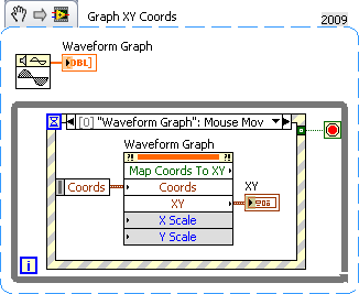
the mouse position on waveform graph
Hi all!
Is it possible to get the data? I use graphic waveform to present data. Thin zoom I now the position of the mouse XY (best with regard to the actual scales of the plot).
Thanks to you ALL
One of my most used methods is the Coords XY card
-
Is it possible to change the color of audio waveform on CC first timeline?
This may be nitpicky, but I lived my whole life with the audio waves being darker than the background. Now in version CC the waveform is light and the background is dark. Mentally, I am struggling with the negative space.
I presented a http://www.adobe.com/cfusion/mmform/index.cfm?name=wishformtted
If you use the new view it resembles the waveform side hangs down.
-
Change the color of point on graph if it is in a certain range
I have a field that got a red line on it, which is the speed of a pump. Pumps have a maximum flow, and I would become the points pink when it is hit and back to red when it is below. How would I do this programmatically?
First, what type of chart do you use? A XY chart would be easier. Basically, the idea is to have several plots which visually resemble a single parcel in the screen. A plot would be the normal range with points of a single color. The plot on the other would be the right point with a different color.
Mike...
-
amplitude of the waveform graph
Hi guys,.
could you please tell me how to control the amplitude of a waveform graph. I want the mV amplitude, and I want to control the scale of numbers also.
Thank you
Bill David
Bill David,
You want to manually set all by developing the program or by running program?
For a manual start by turning off Autoscaling on axis Y. Then comes the value end upper and lower values you want.
Programmatically is similar except that you use property nodes. Some properties have names that might be a little confusing, you may need to do some exploration and trial. Context-sensitive help and help detailed will be your friends.
Lynn
-
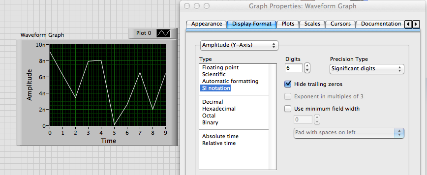
Change the axis label w.r.t. the scale automatically in the waveform graph
Hello
Is it possible to change category axis labels and the value the axis according to the scale automatically? I have a waveform graph which is automatically resized and values on the y-axis of milli, micro and nano volts according to the results of the output from the tests carried out. I need the label of the axis to change automatically according to the scale... Could someone tell me please how to do this. Thanks in advance.
Best regards
Julien
Alain,
I don't know exactly what you want.
If you want to just scale to change as follows: 10n or 5u, use the property format scale IF the Notation.
If you want to change the name of scale label text, you use the YScale.NameLbl.Text property. The attached VI shows one way to do something like that.
Lynn
-
How to programmatically change the width of a graph?
How can I programmatically change the width of a form of wave or waveform graph? When I create an implicit property of a chart or a graph node, it is read-only. Change the boundaries of the parcel has worked in earlier versions of LabVIEW, but not anymore.
It works for me in LV2013 but I use the plot area: Dimensions: width property.
-
Two background colors for the same waveform graph
Hello guys!
I have a question for you: I am a new user of labview, so please be nice!

So here's the deal: I just created a thanks 4 thermocouple temperature registration program.
In real time, I then have a waveform graph 4 curves as soon as I start my program. And in my program, I had a button that allows me to record the temperature in a file for a period of time at a certain frequency.
So, what I have is: I got my chart of waveform with a black background for example, and once I pressed the button, the background color will be changed automatically to highlight the part of the graph where the record occurs, then the background will return to the black after finished recording. In this way, on the same graph, I could say that registration took place from here to there by looking at the graph. I have two different background on the same graph.
I don't know how to change the background of a chart using the property node, but is it possible to do what I want?
I hope I'm clear. Otherwise, feel free to ask me for more details... I might post my vi if necessary
See you soon
Well, I know this is not exactly what you want to do, but you can try the following.
Change the color of the line on the chart when recording occurs.
You could therefore have a red line, then press on save, then it turns blue, then back to red.
And when that is confusing since you have 4 different lines on the chart 1,
You can change to a red line and a dotted red line, for example.
Would that be acceptable? If so, I can show you how to do this.
-
Change the color of the graph by programming
HIII everybody,
I have to draw 12 plots in a waveform graph. I chose the colors in the legend of land for each parcel. But I don't want to display graph 12 at a time. I have as many checkboxes for selection as graphical user settings of the parameter to which want to see. I did what his works well.
But there is a problem in the color of the graph, if I select 12 parameters at a time, then it displays with the same color I selected on the legend of the plot. But if I choose to less than 12 parameters labview assign colors in series without distinction of color affected. I have attached the VI please help me with this.
Thank you best regards &,.
Manisha
Your problem isn't that you have changed the colors on the chart, it's that you have change the label. Actually, you have restructured your table in its entirety.
Why don't you use the Visible field? property to determine what is visible. Now you're talking almost no code.
-
Put the data of the set point in a waveform graph
Hello
In a graph of measure, which is the result of a waveform, I would add data of the set point as well. How can I add this data to set for the chart value?
In a control loop system, the output is controlled by a labview program. I would like to see the point of this system as well as in the graph, these thresholds are changed at random times, so I don't know how to create a waveform of these data. Should I create a waveform of the setpoint, or y at - it another option to show the set value in the chart?
See you soon,.
Rolf
That can make it much more difficult.
At one point an array of 1000 points need to be assembled (obviously). How do depends greatly on your structure. Synchronize the time of the two signals can be very difficult. It would be easy if the set value only changed once a cycle of 1000 point.
You may want to read the SP as an analog input, so you get 2 samples of the material here. In this way the two will always be synchronized. But I'm done alleady assumption, like this, the signal is an analog input (and the target value of one analogue output). What equipment do you use?
I think always need you a loop to get data and a loop to set the SP. The two loops will be more parallel execution GLSL and synchroniseent. The trick is to synchronize, or for the deterministic timestamps in two loops. If you can make that happen, you 80% there. You could do loops timed loops (using the same clock). Then you get the timestamps in two loops. The MS loop has the queue changes, pushing the value and time. Then the loop of data can use values and hours to create examples of sp 1000.
Maybe you are looking for
-
Toshiba laptops and overheating with Linux
If you have a Toshiba laptop that seems to be overheating in Linux (like Ubuntu Linux), it is likely that this is due to bad "DSDT tables" (which refers to such things as energy saving) in the laptop. Each computer has a description of material data
-
Cannot download document Pages on Facebook
I have a new MacBook Pro with Version 10.10.5, Yosemite and Pages ' 09 version 4.1. I created an ad with Pages, import a picture. Because I did not yet understand the new system of Photoshop and Lightroom very well, I made a copy of a photo and place
-
I'm using labview for the fault diagnosis, where the entrance would be numerical values such as temperature or vibration and after defuzzification reading, I want the output to a particular type of fault example imbalance of the tree or fuel pump fau
-
I tried to update the driver, but couldn't.
-
Help... How to use the recovery on Pavilion g4 2014tx partition
Hi all... Would like to ask how to use the recovery partition and what is the effect if I used it... ? Thank you...