3D graph log scale "characteristic".
Another annoying feature has just discovered in the 3D graphic object: scale logarithmic, you can set the limits of an axis, but it will be ignored by the chart itself.
For example. Here are the settings that I set for the axis Y. Note the minimum value of 5?
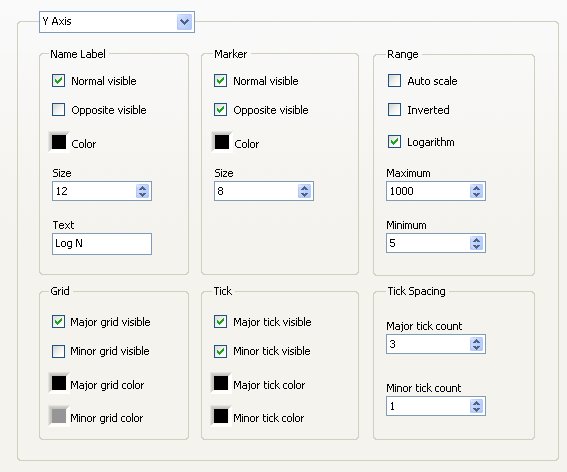
Well, fat chance... Here's what LV is willing to do:
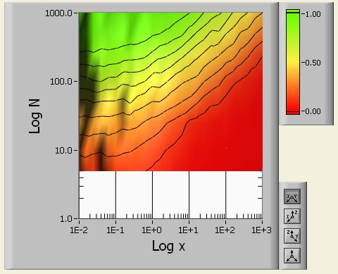
Now, in edit mode, I can change the balance itself and force the smallest value of the y-axis to 5, but here is how it goes:
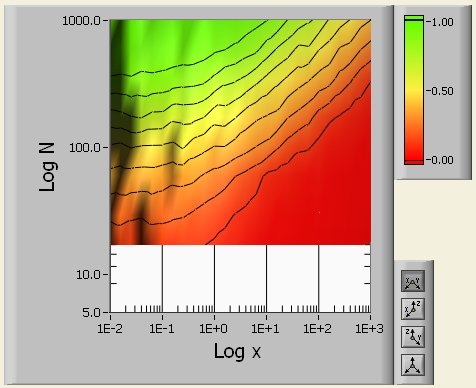
Not cool!
Hi X-).
This was reported to R & D (# 292956) for further investigations.
The best solution is to make sure that you set the minimum and maximum values for a logarithmic axis of a power of 10.
Thanks for the comments!
Chris
Tags: NI Software
Similar Questions
-
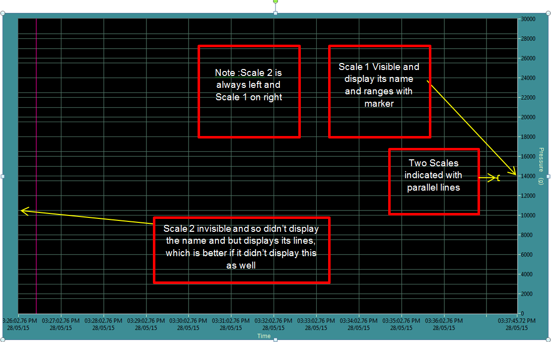
XY Graph-Y-scale visible on the scale of Y corresponding watch still false Max and Min
Hi guys,.
I use the XY graph to display the data with 3 Y-scales.
When I put any scale Y property visibility to False, its display even the Y scale Max and Min range lines in the plot area of the chart and cross line or additional parallel line with other visible scales.
Attached to the page Ref.
And I know that the cross-line may be due to different ranges of scales is defining. But the XY graph does not show the scales are invisible and possessions as well.
Please provide your suggestions to avoid this.
Scales and lines associated with these scales are separate properties. I've never tried and now I'm not in front of a computer, but should have properties for the definition of the grid line color. Implement transparent.
Mike...
-
control reversed (or log) scale, XY
I would like to represent the scale reversed in XY graph.
How can I read or write the property of inverted scale?
For example, as shown in the room attached, the range property has not shown the information of inverted scale.
But I can control these properties (record or reversed) in the property dialog box (by right mouse clicking on) for each scale.
labmaster
Hi labmaster,.
Sorry for the bad suspicion.
But: range adjacent to the property, you will find the property 'Reversed' who does what it takes...
-
questions of small scale log values
I have a strange problems with tracing values in graphs for NI Measurement studio WPF. This problem occurs when the axis is log based on and the value on the axis spans less than 1 to 1 (i.e. 0.001 to 1000). The chart automatically change the lower x-axis to limit to 1. The behavior is similar to the one reported here (http://forums.ni.com/t5/Measurement-Studio-for-NET/log-scale-won-t-scale-to-show-small-values/m-p/27...) but in my case, none of the mapped value is 0 or less than the lower limit of 0 and the axis is set to greater than 0.
The code below will reproduce the problem:
Focus() pt = new Point [100];
for (int i = 1; i)<=>
{
PT [i-1] = new Point (0,1 * I, me)
}Field pl = new Plot ("test");
PL. data = pt;
Graph Plots.Add (pl);
Where the x-axis of the graph are log10 scale (and the boundaries are defined on {0,1, 10} in the code .xaml) and the y axis is linear (no matter the scale really). The chart automatically x-axis it 1 and this can be changed to 0.1 but it comes back again to 1 if the visible property of the chart changed.
This behavious doesn't happen if all the x-axis values are less than 1 or greater than 1 that is the code below to draw correctly and the axis is not reset to 1, etc.:
Focus() pt = new Point [100];
for (int i = 1; i)<=>
{
PT [i-1] = new Point (0.001 * I, me)
}Field pl = new Plot ("test");
PL. data = pt;
Graph Plots.Add (pl);
Someone knows it why it behaves like that and what can we do to fix this?
Which seems to be the case, it's that the default
FitLooselyrange adjustment see values ranging from 10-1 to 10-1, and then choose a range of0,10for data. Since no one can be represented on a logarithmic scale, forced the scale to an arbitrary value, less than ten years, thus giving a final range of1,10and truncating low values. I created a task to solve this problem.To work around the problem, you can change the
Adjusteron the scale to another value, such asFitExactly. -
Graph XY - linear scale data overlay / Journal
Hi people,
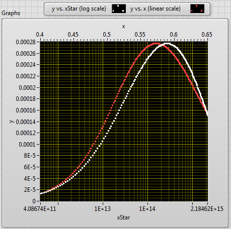
I'm in LabVIEW 2012 and I have a (x, y) dataset I want to draw on a set of dimensions. I also want to superimpose a second horizontal axis with the same data, but using a set of units on the scale (xStar). You can watch the enclosed screws to see how x transforms xStar, but it's basically the quadratic formula with an exponential lift. The x values are plotted on a linear scale, but because of this exponential transformation xStar-values are reported on a logarithmic scale (see image).
I want these two studs--(x,y) and (xStar, y)-to overlap exactly what they are actually a single parcel. That, in view of all (x, y) point, I can quickly raise the value of xStar glancing at the scale of the secondary axis. x and xStar are two useful physical parameters, then it is useful to be able to read one or the other on the chart depending on the situation.
Any suggestions on how to get these two plots overlap? Currently, I use the min/max-x values to generate appropriate min/max values xStar, which makes the plots suitable for endpoints (but not between the two). I also need to specify somehow scale increments? If so, what is a good method to achieve this?
Thank you!
The non-linear relationship (no log) is between x and xStar, you chose a logarithmic scale grid, so I guess that 'linear' scale must be adjusted.
Since the x-> xStar relatiion is given and fixed to a scale, you can create an image on the chart with the tools of photography.
read the newspaper scale min and max, read the pixel length x in the plot area and when the scale is changed (event) recalculate and pull scale "lin".
-draw minor ticks, draw the main graduations and numbers.
I would just use a scale, add a cursor block him to the plot and use changing the same cursor (read pointindex, get x, y data) to view xStar, x and y
I posted a vi accidentally in this old thread

-
data is plotted on the graph of absolute time delay
Hi all
I'm plot data on a graph of absolute time and I find 2 hours difference between the data displayed by the debugger (left) and data on the graph (X - SCALE AUTO).
The time saved in ptTime, was acquired by using the function 'time' and the PC has Amsterdam, Berlin, Rome as time zone.
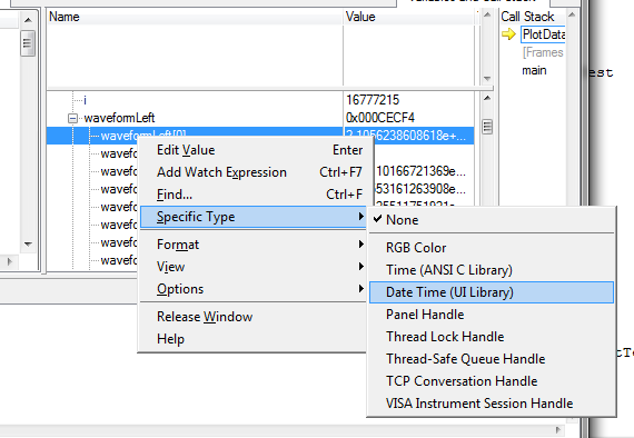
Here, under a screen shot that implemented the code, the debugger and the result.
The debugger is also showing the version in good time!
Can anyone suggest me how to process data in order to have the same result on the debugger window and on the graph?
A big thank you and best regards
Sergio
Question: in the CVI debugger show you, the time_t variable appears as a double, while its definition in 'time.h' is ' typedef unsigned int time_t; "so I am a little confused.
Response: I did something nonsense in this screenshot: I took a variable of type double (it happened to be a UIDateTime, actually) and configured the debugger to format as if it were a time_t variable. The formatted values that the debugger shows me, therefore, are not valid, of course. But I just wanted to show the time_t format, because it corresponds to what you have in your screenshot, and I was already suspicious that you use time_t variable to pass to the curve.
Furthermore, if you are not familiar with the way in which you can change the formatting in the debugger, this is how you do it:
Usually, the debugger can automatically pick the best format to use, based on the data type of the variable (for example, with variables of time_t). But in this case, what the debugger calls a variable "Date Time" is all just a double. The debugger cannot assume that you want to display all your double variables as a 'Date Time', and so you need to replace yourself.
Question: I was not able to find UIDateTime using the ICB type, this is the value returned by GetCurrentDateTime(double *)?
Response: There is really no such thing as a type of data "UIDateTime". I've been a bit remiss with my terminology. Unfortunately, when you're dealing with dates and hours, there are several possible representations of these quantities in the world of C, and it is important that you use the correct the intended variant you use for. In this case, the chart controls expect that you pass the time format used by the library of user interface, that is, one that is returned by the GetCurrentDateTime or MakeDateTime functions. The underlying C for this representation of the time data type is simply twice, and so it is not a good name to refer to it. That is why I used UIDateTime, but I should have been clearer than that.
Question: Y at - it a function to convert time_t values UIDateTime values
Response: Yes. You can use the functions of the programmer's Toolbox following two, in exactly this order:
CVIAbsoluteTimeFromCVIANSITime (time_t ansiTime, CVIAbsoluteTime * absTime);
CVIAbsoluteTimeToCVIUILTime (CVIAbsoluteTime absTime, double * uilTime);
-
graphical WPF detect the mouse on the axis
How can the interaction of the mouse with the axes of the events? With graphics WF, I used following code:
switch (graph. HitTest (provable, e.Y))
{
case XYGraphHitTestInfo.XAxis:etc...
You can use the
GetScaleAtmethod to detect a ladder to a given mouse position (GetChildrenAtPointshould return scales as well, but this does not work in the current version).Here is an example of using
GetScaleAtin theMouseLeftButtonDownevent on a graph (note that the graph should have a background of testable success asTransparent, instead of the value defaultnull, or only clicks exactly on the visuals in the balance works):private void OnGraphMouseLeftButtonDown( object sender, MouseButtonEventArgs e ) {
Point screenPosition = e.GetPosition( graph );
var scale = graph.GetScaleAt( screenPosition );
Console.WriteLine( "Scale at {0}? {1}", screenPosition, scale == null ? "no" : "yes" );
} -
Digital control over several orders of magnitude
Hi all,
I'm trying to get a digital control with a suitable addition to the order of magnitude.
For example, I have a front panel for an osziloscope, sometimes that samples on some ns, sometimes a few seconds, sometimes a few milivolts, sometimes a few volts, who knows, right

I was playing around with the digital control units, but it doesn't quite fit my needs. I can't change the prefix of a unit on the duration, for example of microseconds to seconds, but then I change the issue as well, because on change the prefix, the previous number is only multiplied by the factor according to, for example, 1000, so 5 became US 5th-6s. So change the record length of the default value of 500 ms to 100 ns would require two klicks type, and I can instead just type "100th-9', which is good too."However, I would like to have a digital control from 0 to 1000 combined with for example a button for prefix i.e. nano, micro, mili etc. and combine this values internally, i.e. of mulitplying accordingly. But I couldn't set the increment to "3 orders of magnitude" even with the option to log scale.
I know, I could use an enum with the names and values according to, but this is not very satisfactory.
So perhaps the question would be: is it possible to combine two digital controls or the value for the prefix, in a suitable and easy way? Or how do you manage the digital values over several orders of magnitude in a case like mine?
Thanks for your replies in advance.
Best,
bastlwastl
Display format is SI units
It helps in these situations
-
Inverse of GetGraphCoordsFromPoint?
I need to superimpose a camembert (from piechart.fp, with a transparent background) on a XY graph, with pie centered at some (x, y) coordinates on the graph.
How can I programmatically obtain the coordinates of the Panel from the point (x, y) on a chart control? It seems to be the opposite of GetGraphCoordsFromPoint, but I can't find such a function.
Thank you
Ian
I think not only remember one function that does what you want: you'll need to play with graph axis scales and dimensions of the graph to get a valid set of coordinates in pixels.
I designed a simple solution in the attached draft: it uses a canvas to draw a circle on the graph and it is far from optimized (such as an example, it does not take care of the Center coordinates outside the area of the graph), but it can be used as a framework for ro develop you your own function.
-
Calendar and the problems of data collection with the DAQ Assistant
Hello NOR Developer area,
I am a Novice of LabVIEW and have seen how helpful you all can be, and if I come to ask for your help.
I'm having some trouble with a VI I built that specifies an input voltage, a SCB - 100 connected to a PCI-6031E and converts this tension in a temperature displayed on a waveform table. The goal is to give a constant reading of the temperature and display it in a chart for as long that the VI is running (and to reset the chart the next time the tracks of VI).
The problems I've encountered currently are:
-After a few minutes of the VI running, I get an error message 200279: tried to read samples that are no longer available. The requested sample was already available, but has since been replaced. (to the DAQ Assistant express VI).
-I don't know how to change my chart so that the minimum value X is both during which the VI was launched and have the maximum X value increases with each iteration of the loop. Currently, I have the VI get the time system and contributing to the property node X scale. This worked for the graph of the voltage, but not for the temperature chart
I appreciate those of you who took the time to read my post.
Thank you all for your help.
Sincerely,
Ethan A. Klein
SB candidate in Chemistry & Physics
Massachusetts Institute of Technology
Class of 2015
PS I enclose my VI to give you a better understanding of my current situation.
E A Klein wrote:
Thanks for writing.
What property node is talking?
I do not understand that many different data types. How can I go on the treatment of all the data?(Did you mean I should wire 'blue' data for mathematical functions rather than using the node property tension?)
Sincerely,
In fact, one of the nodes property. I mean specifically the tension property node. But in reviewing, I noticed the other nodes in property for the chart. Just set auto-scaling to the X scale and that should take care of two of the nodes property (right click on the graph, X scale-> AutoScale X Scale). I also recommend placing your mathematical functions in a Subvi to make things easier to read. Attached, that's what I think you're after.
I hope that these small tweaks will speed things up enough to avoid your error. If this isn't the case, then we should begin to look at the design of producer/consumer model or take readings at the same time. It might also be worth looking away the DAQ Assistant and DAQmx real screws. But one step at a time.
-
Do curve a real - time of the linear adjustment computed
Hi, here is how my program works:
(1) plot data read from a file
(2) user can move the sliders to select a range of data
3) allows users to choose the scale with control 2 Y (Y minimum and maximum)
(4) make a linear adjustment of certain data in real-time and gives the results.
And there's no problem, I asked the graph xy of a while loop in which I drove
(1) the function of fitting (selection of data to 2 inhabitants variable (cursors)) and table functions
(2) local variable 2 (write) to adjust the scale Y with the number in the control.
Data and sliders move user appear, all right.
The problem is that I want to draw the fitted line of the xy-graph, so I did 2 x 2-number-table (with x = 0.1 and y = intercept, slope + interception) and...
I must establish xy-curve in real-time to the Assembly line to refresh on a cursor move XD
So I put the chart at the time, and I traced it each time the moment of the cycle (I used a condition with shift register to skip unnecessary calculation).
And here's the problem: when the xygraph is traced the scale there is the default. A few ms then the scale will have correct (when the program has wide are the values of controls).
Is there a way to avoid that the graph will go to scale by default when it is drawn again? Or is it possible to trace the line of editing without trace all the xy graph?
Thank you
PS: I tried to put a sequence stacked with paint 1) graph 2) scale but cen see you in any case the flash of the scale Y incorrect
I think all you need to do is disable autoscale for axes.

Overall, there are a few very complicated and very dangerous built code. Here is a small sample (are there many, many others!):
The code on the left can blocking the program, for example if the data are all zero. Why is there a local variable? thread just from the source, it is just there! What you probably want instead of these small while loops is the array of threshold function. No need to loop.
To write two properties, you use oven (!) property and three structures of sequence nodes deep stacked. Property nodes are running up and down, so all you need is the code below! Also note that 'table of index' is resizable. You don't need to wire the index unless you want something special.

-
Toggle button to do two series of shares?
I'm trying to simply hide / display a component (a graph that scales and moves between States) with a toggle switch, which seems very difficult. (The chart would be 100% opacity when toggle is selected (in his four 2nd States) and an opacity of 0% when the scale is turned off (in his first four States).
The problem seems to be a toggle button can't do an action (or set of actions) when clicked, instead of having 2 different sets of actions, each one in its market and stop State.
The only way that I was able to deceive this thing to the kind of work was to make the graphic part of the button switches, which is on the 'selected' States (but of course now, the chart cannot automatically change (location + scale) among the States of the application - its stuck inside the component button.) I tried to even make this graph (inside the button) a component customized with several States (in its respective locations + scales), but I couldn't find a way to have an outside element (ex: the button that changes the application States) drive change of States of this graph in the toggle button.
I hope my description makes sense.
Is there a way to make a button that switches between 2 sets of actions?
Thanks in advance. z
Hi Zachary,.
Currently, it is not as easy in Flash Catalyst, we would like to, but it can be done.
The standard to do this is to place your image inside a custom component and to give the two component States: visible and invisible. Then your toggle button can toggle the State of the component in back - changing the drop-down list of ' when in any State "to do different things depending on whether the component is currently visible or not.
In other words, you add:
- When the click on > play the State Transition > Visible > when in Invisible
- When the click on > play the State Transition > Invisible > when in the Visible
This has a drawback: in Flash Catalyst CS5, put the graphic inside an element means that you can not have resize in different States of your overall application. This isn't a problem in the next version of Flash Catalyst (code name "Panini"), where you can create fully resizable components.
In the meantime, you can work around this restriction with a trick - it's messy but works like a charm. You can use a custom component hidden to store the visible/invisible state watching your interactions (as above) and keep the chart itself outside of the component.
Thus, instead of the above, you must add:
- When the click on > play the sequence of actions > when in Invisible
- In the first action sequence, select the chart and choose Add Action > fade and set it to go from 0 to 100.
- Then as a State action of component set to define the State of your component hidden visible
- When the click on > play the sequence of actions > when in the Visible
- In the second action sequence, select the chart and choose Add Action > fade and set it to go from 100 to 0.
- And then as a State action of component set to define the State of your component hidden in Invisible
Hope that helps!
-Peter
-
switch between log and linear waveform graph
I have a waveform graph that plots linearly. However, it causes an error during the logarithmic line tracing. Is anyway to create a switch that allows me to change between log and linear plot without creating additional graph?
Thank you
Chris
Use a property node: Y Scale.Mapping Mode. Written 1 to the node passes in logarithmic mode and 0 is for the linear.
Lynn
-
Is it possible to add some offset on the scale of a graph Y when autoscale mode.
Hi all
I'm drawn on a graph of waveform autoscale mode. I want to be a disconnect on the side upper and lower scale Y. is it possible to implement this.
Thanks in advance,
Karine
The only way that came to my mind is to autoscale by yourself:
-Find the min and max (vi ready for this)
-Add a percentage of the range min and max
-Optionally constrain the new min, max accordingly to a round number (according to log (range))
-Scale set with properties
Another way:
Add a plot with the same data (or only the min and max points) with transparent colors and multiply these data with 1. XX (xx percentage extra Beach)
-
Of a complete log of Information can I find myself with several graphs of selected information
I received a great response here before, here's something that I'm not sure is possible... but maybe you know.
Current version of numbers (3.6.1)
So, I create a log of the different courses. Here is a simplified version of what I do:

The idea is so that I will have separate sheets for each of the classes, where I will have the analysis of numbers. For example:

What I would like to have on this page is a graph being each class, day by day, showing the presence so that I can follow increases or decreases trends, from the newspaper on the first sheet.
I thought I'd try to find a way to have a referenced version (Alias) of the main newspaper on this sheet, which I can then do a filter before you apply a graphic, or perhaps a function which will only list info in a new table which matches certain information (such as the title of "Workshop").
I can be looking for a function that does not exist, but if there is anywhere I could get a clear answer on this subject, I figure that it would be here. Thanks for any advice you can give.
Kevin Cunningham wrote:
I can be looking for a function that does not exist, but if there is anywhere I could get a clear answer about it,
Numbers (and other spreadsheets) are good to extract summaries of data and plot summary. Here's a way, using SUMIFS.

The formula in B2, filled to the bottom of the column:
= SUMIFS(log::E,log::$B,$a2,log::$C,$A$1)
The formula in C2, filled to the bottom of the column:
= IFERROR (SUMIFS(log::F,log::$B,$a2,log::$C,$A$1) "/ B2," "")
The SIERREUR function tells number of leave the empty cell if there is an error because attendance is 0.
The graph is 2D 2 axes in the case where you want to do something similar.
Once you have the summary table and table of work, then you can 'clone' them by copy - paste other sheets and put another name of the workshop in cell A1.
SG


Maybe you are looking for
-
6 s/iOS iPhone 9.3.5 Confusion of backup/restore/synchronize
I recently needed to backup, delete and restore my 6s more to unlock it by the carrier. I downloaded iTunes on my laptop and made a captive backup via iTunes and also a backup over Wi - Fi to ensure against corruption. According to receipt messages,
-
Equium A60 - 155 stucks in SafeMode after itself switching
You can see my data from the computer to http://uk.computers.toshiba-europe.com/cgi-bin/ToshibaCSG/jsp/productPage.do?service=UK&PRODUCT_ID=98800 My computer is prone to overheating and sometimes stops. Usually, there is no problem with reboot but no
-
Sims 2 installed, but what disk 1 is handed over to play it says bad disc place the correct disc
OK, so I recently had problems with my hard drive on my laptop Toshiba Satellite A300 and he brought the manufacturer to be replaced. Before the problems, Sims 2 would work with ease, but now after the hard drive has been replaced it will not. It ins
-
Unable to run setup.exe for pcAnywhere
I try to install Symantec pcAnywhere on my laptop, but Vista will not run the setup.exe, and I have a problem with the installer when I double click just not the program. Some game forums suggest workaround the command line to disable the InstallShie
-
Direct reception of SMB over TCP/IP specifically in Windows 7 Pro?
A year or two ago, I had a computer Windows 7 Professional on a NAT LAN with two Windows XP Professional computers, all on the same workgroup. I have somehow managed to disable NetBIOS over TCP/IP on the computer of Windows 7 (currently verified usi